Ehibition stand design (uni)
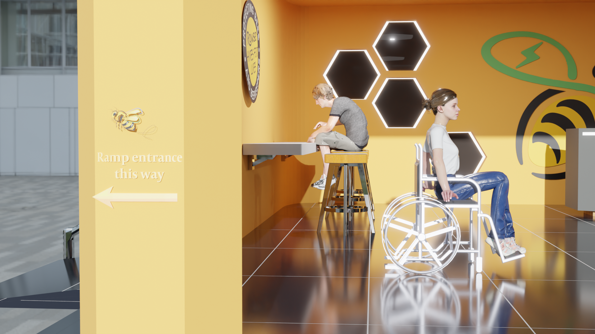
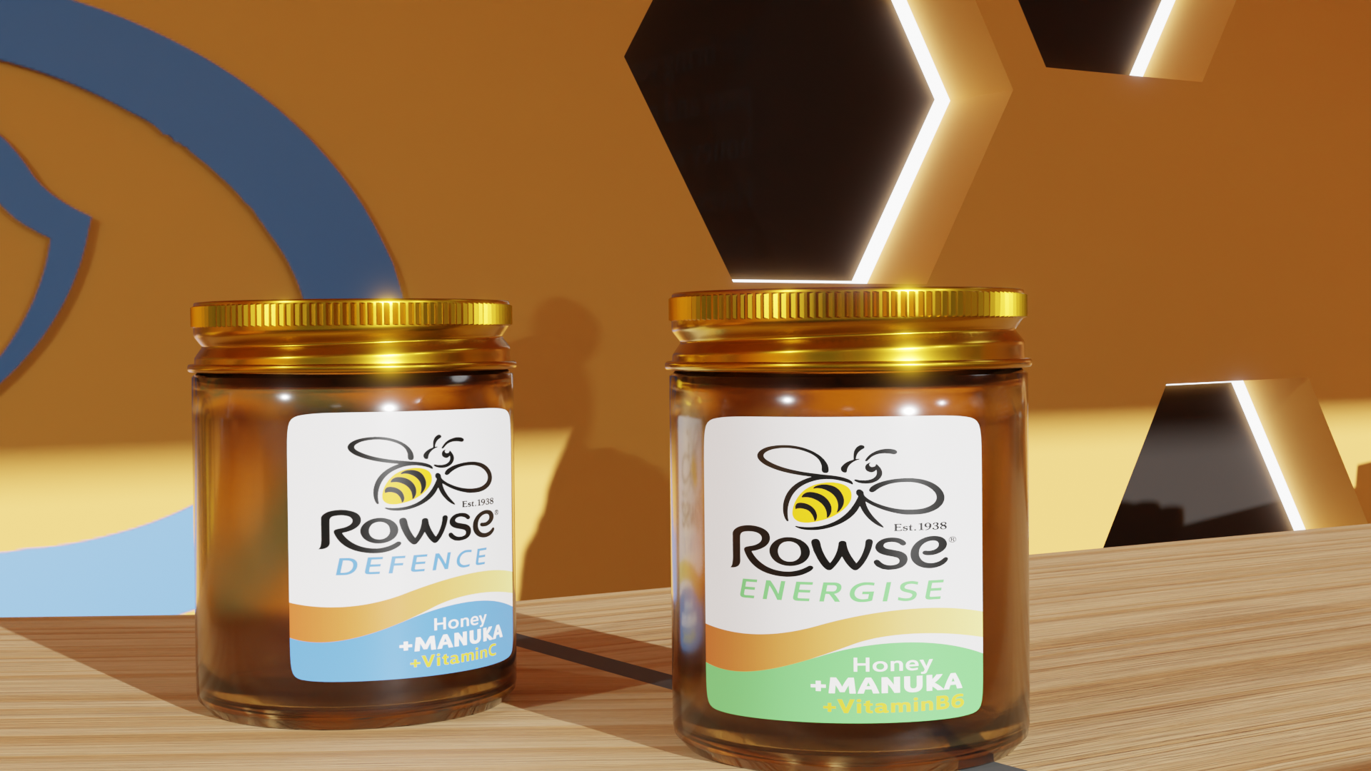
The brief for this project was to create an exhibition stand for the honey company Rowse to promote their new defense and energize honey. The design needed to have signage that gives people more information about Rowse and has handicap accessibility in mind.
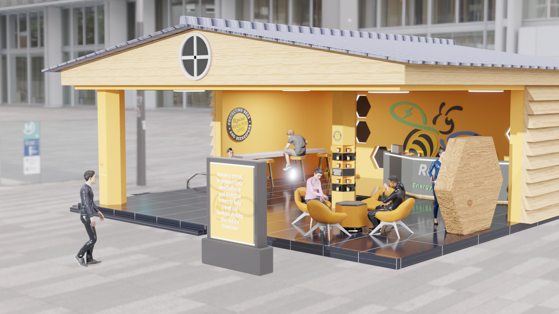
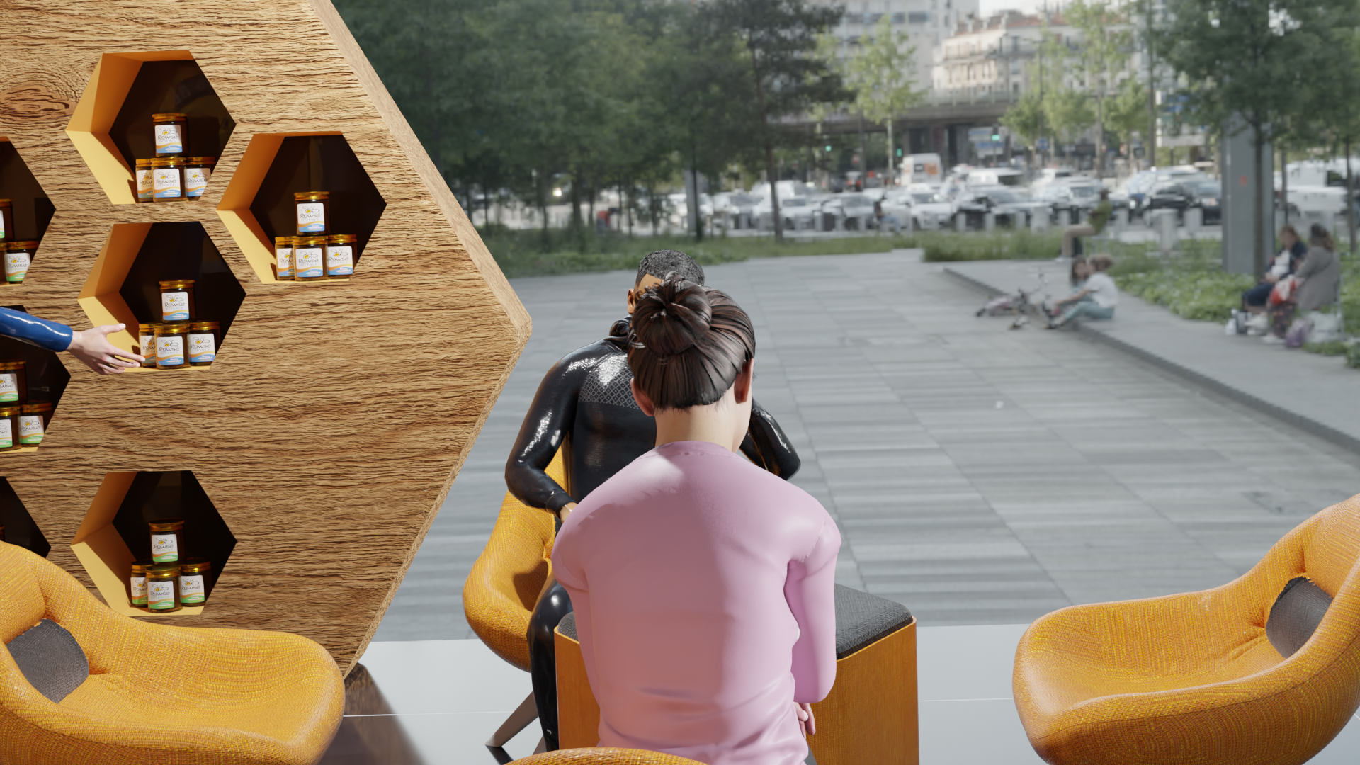
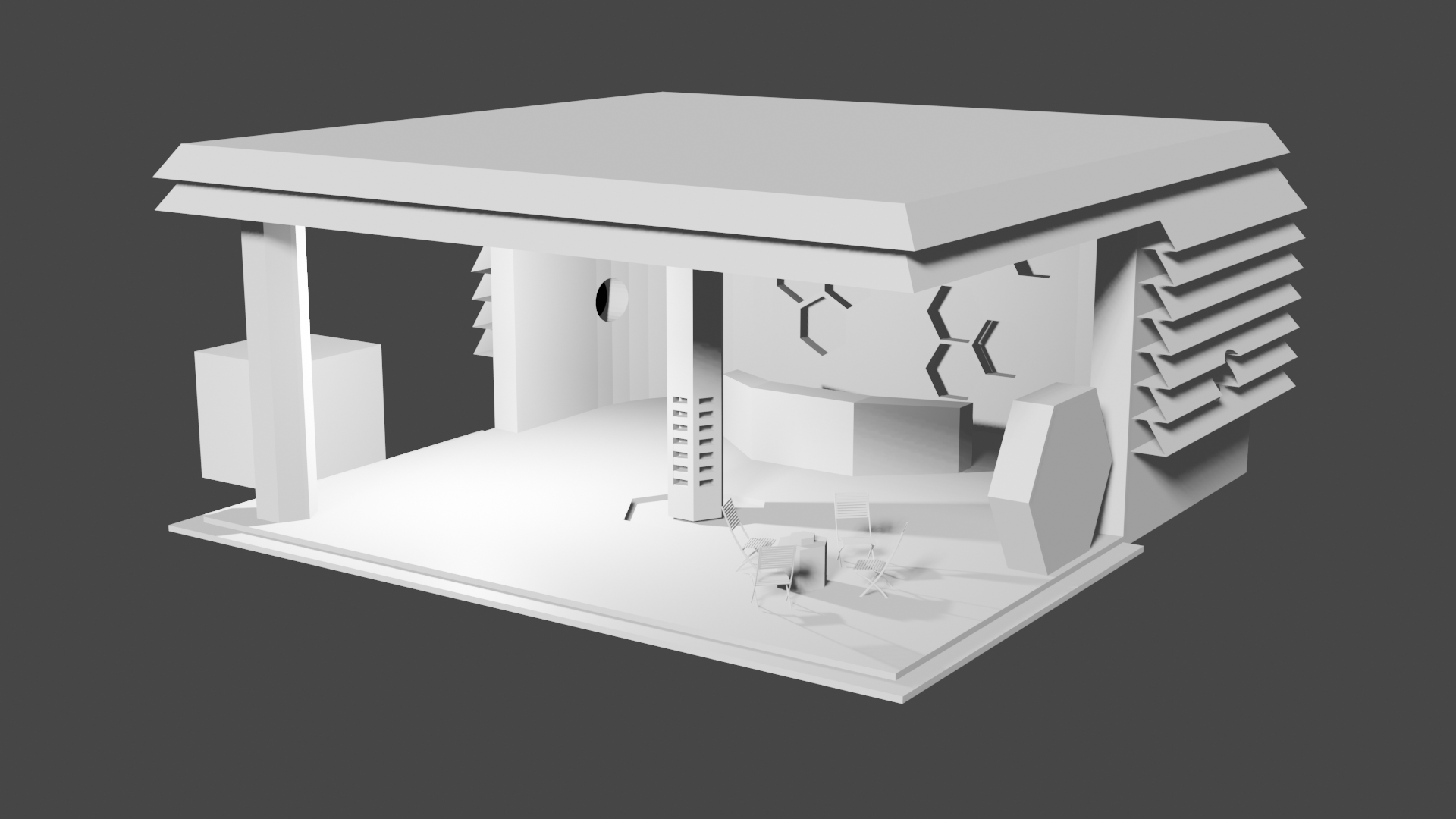
The final design had an open beehive look meant to attract people to take a look and was placed outside so as many people as possible could see it. The inside is meant to be comfortable, including free samples and seating, so that people stay and potentially buy the product.
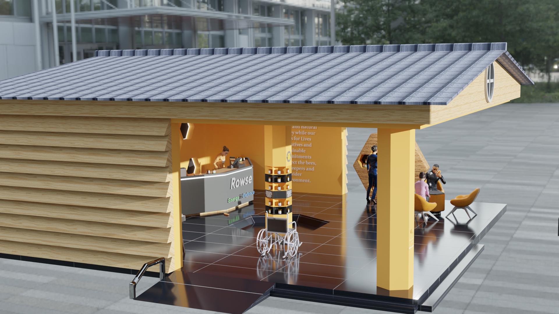
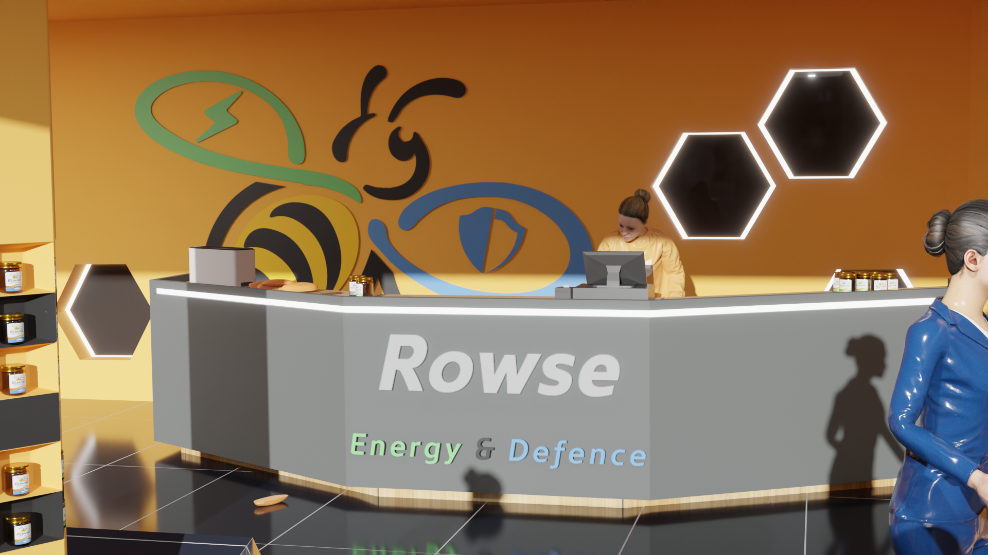
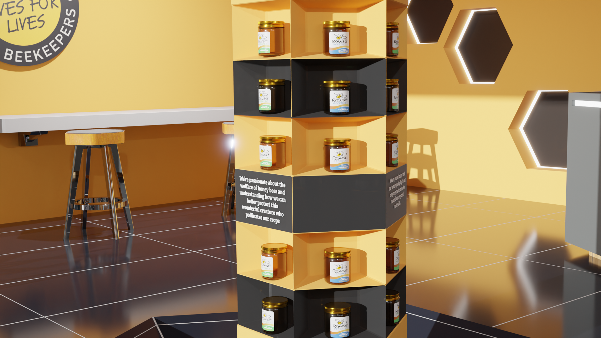
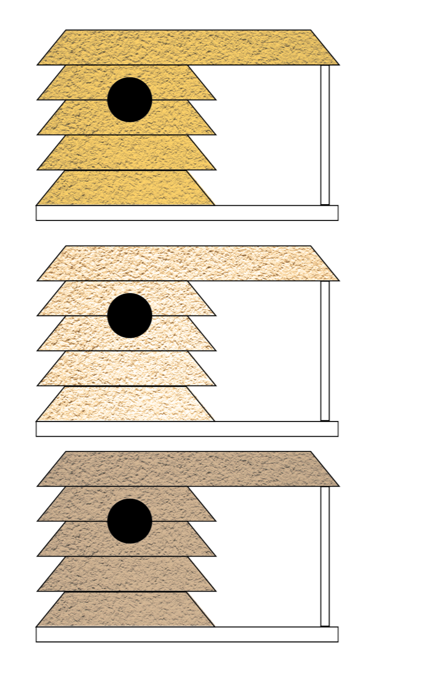
I wanted the beehive motif to be obvious throughout the design, which is why a lot of the elements, like the seating and lights, have that hexagonal shape, but also the shelves are akin to that of a honeycomb.
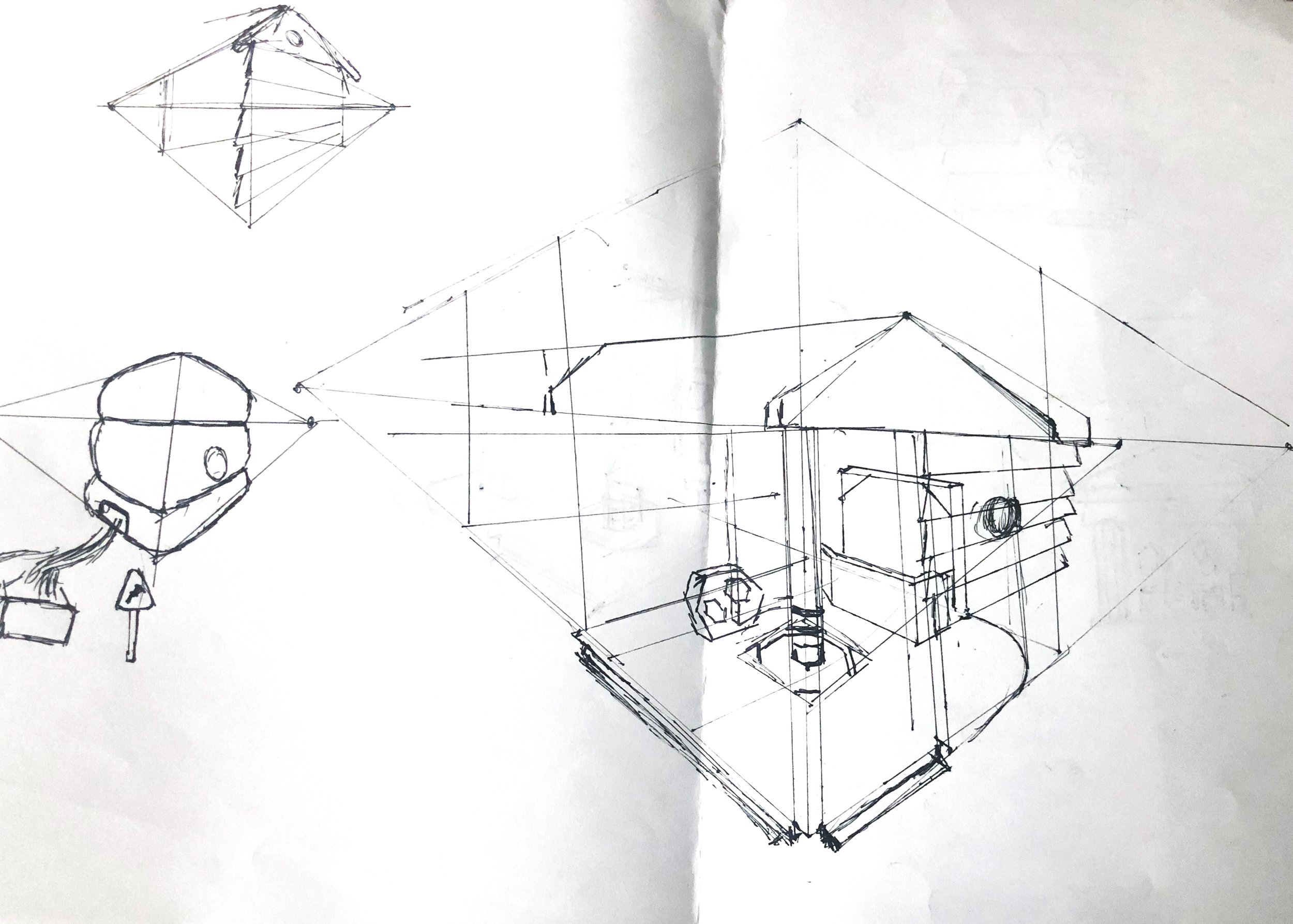
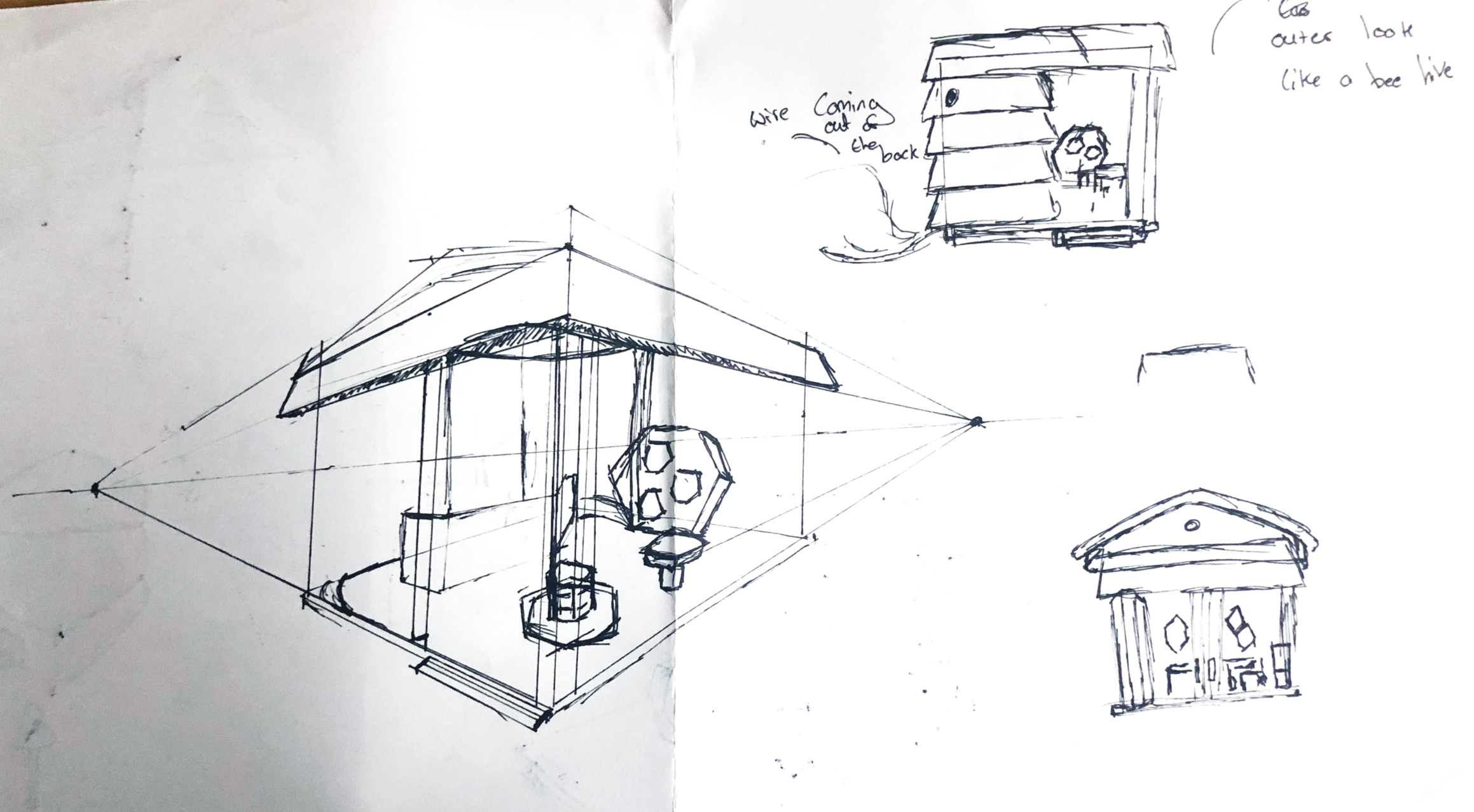
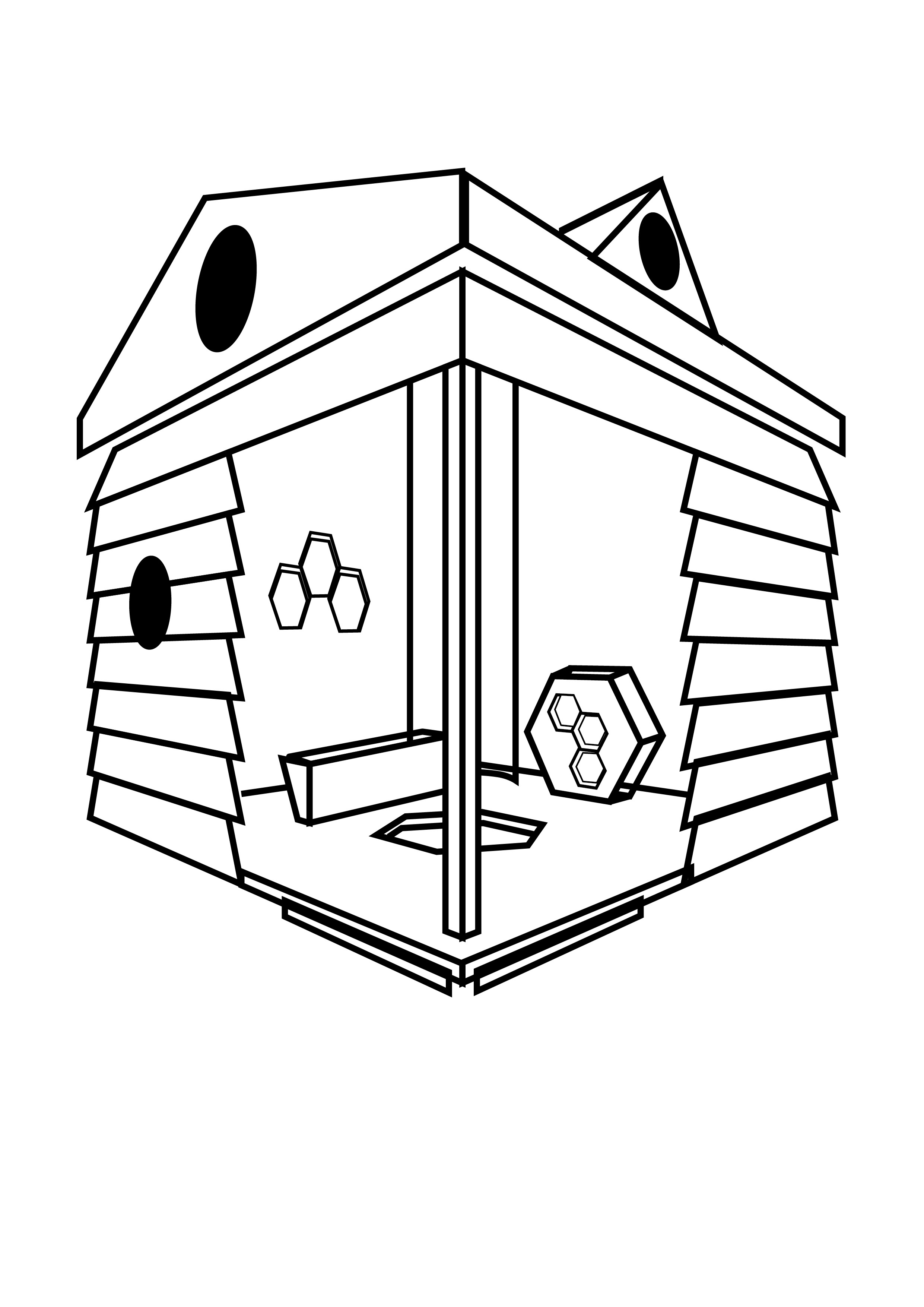
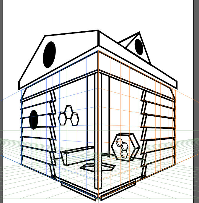
I began sketching potential honey related stand designs slow going from pen and paper to digital to finally making a draft it 3D software.
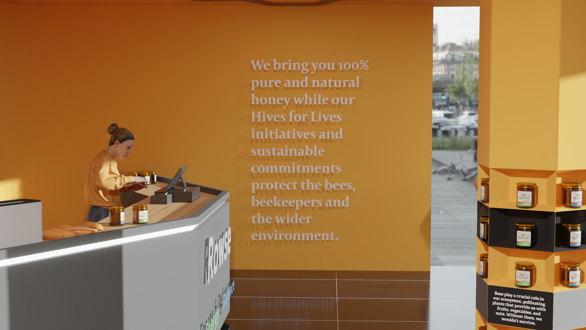
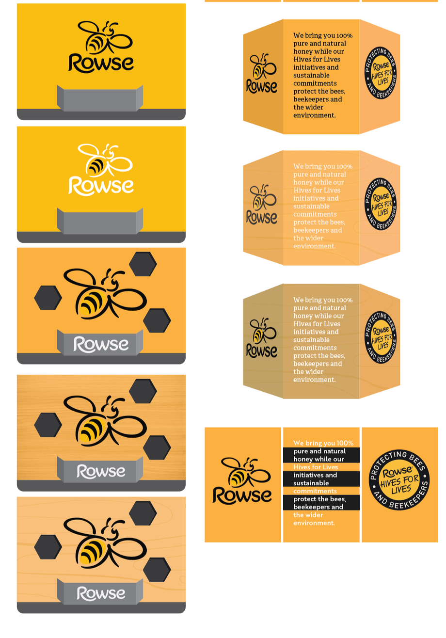
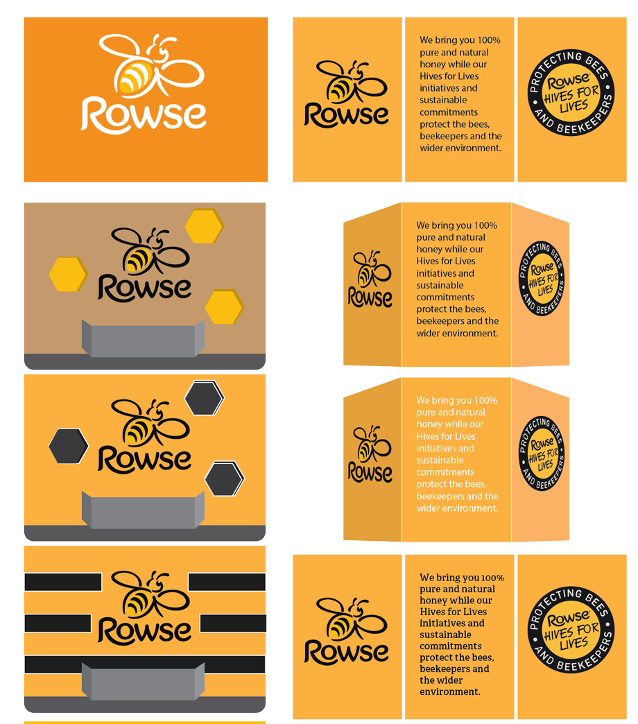
Once I had my layout for how I wanted the stand to look I began looking at what iconography and text I could potentially and r what colors/textures should they be.
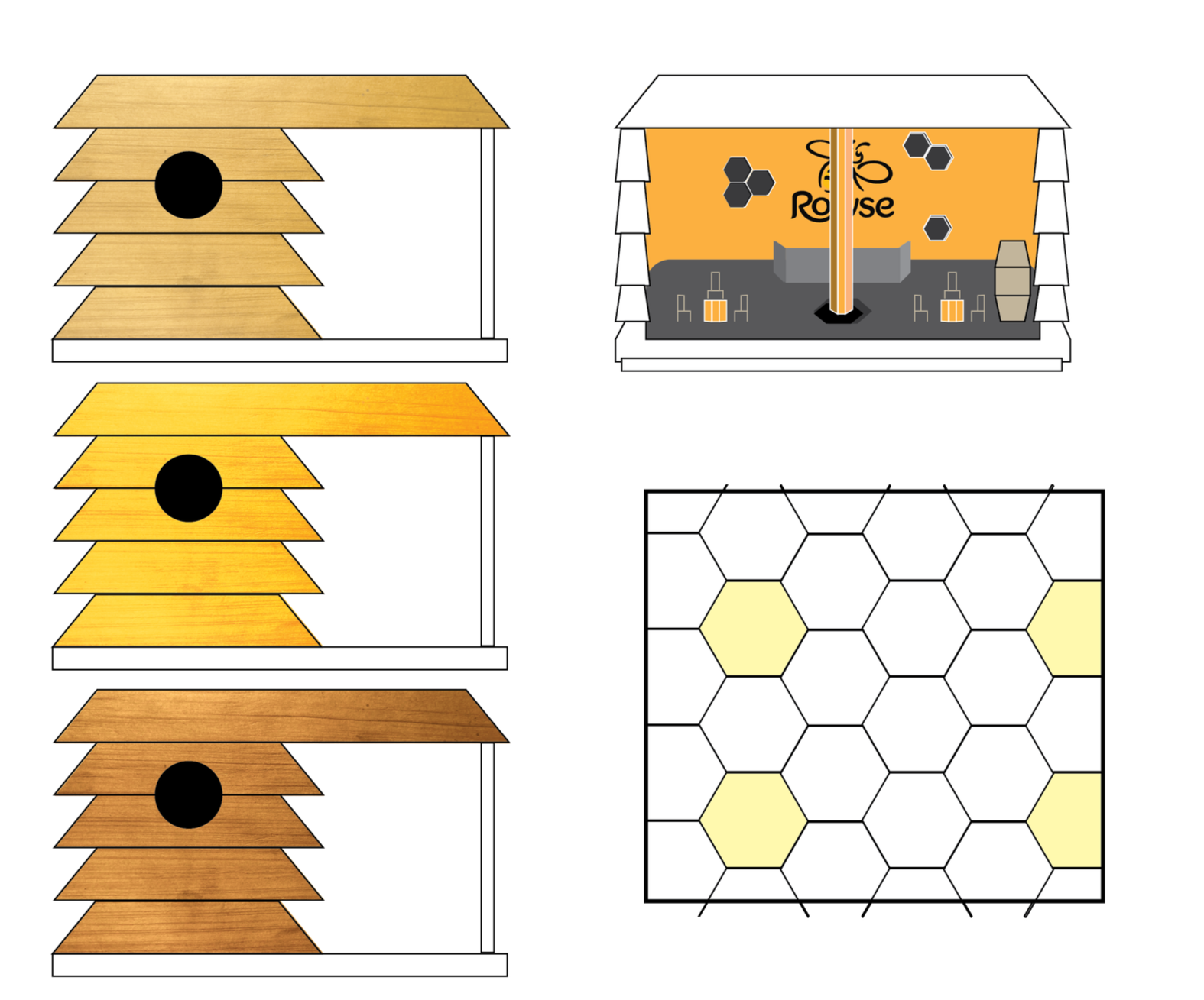
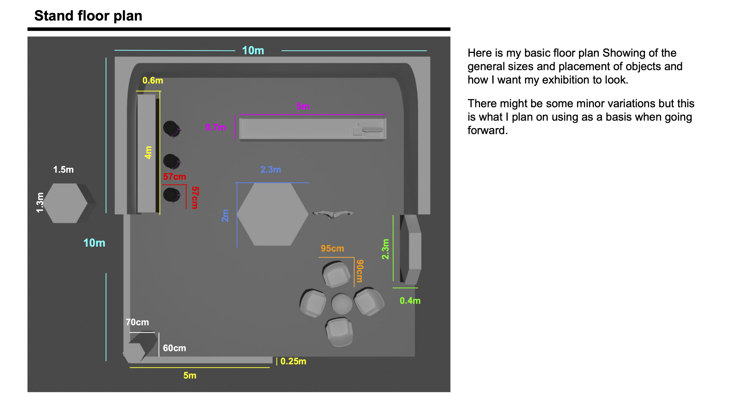
When I finished creating the signage and researching textures, I created the floor plan for the exhibition stand so I could get all sizes correct when creating the final design.
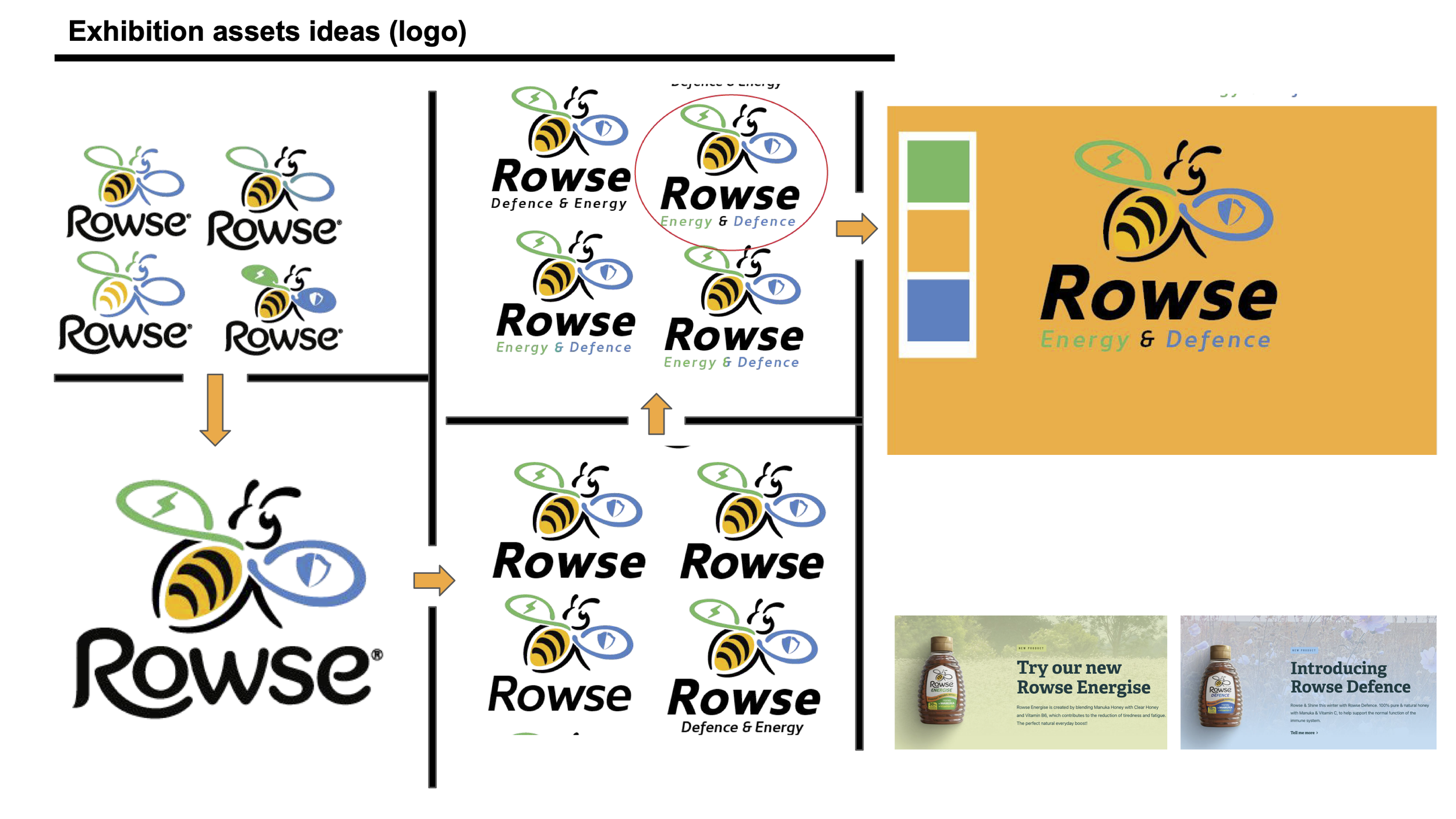
The last thing I had done before creating the design was to redesign the Rowse Honey logo to make an exhibition exclusive design that would fit the theme of promoting their Defense and Energy honey.