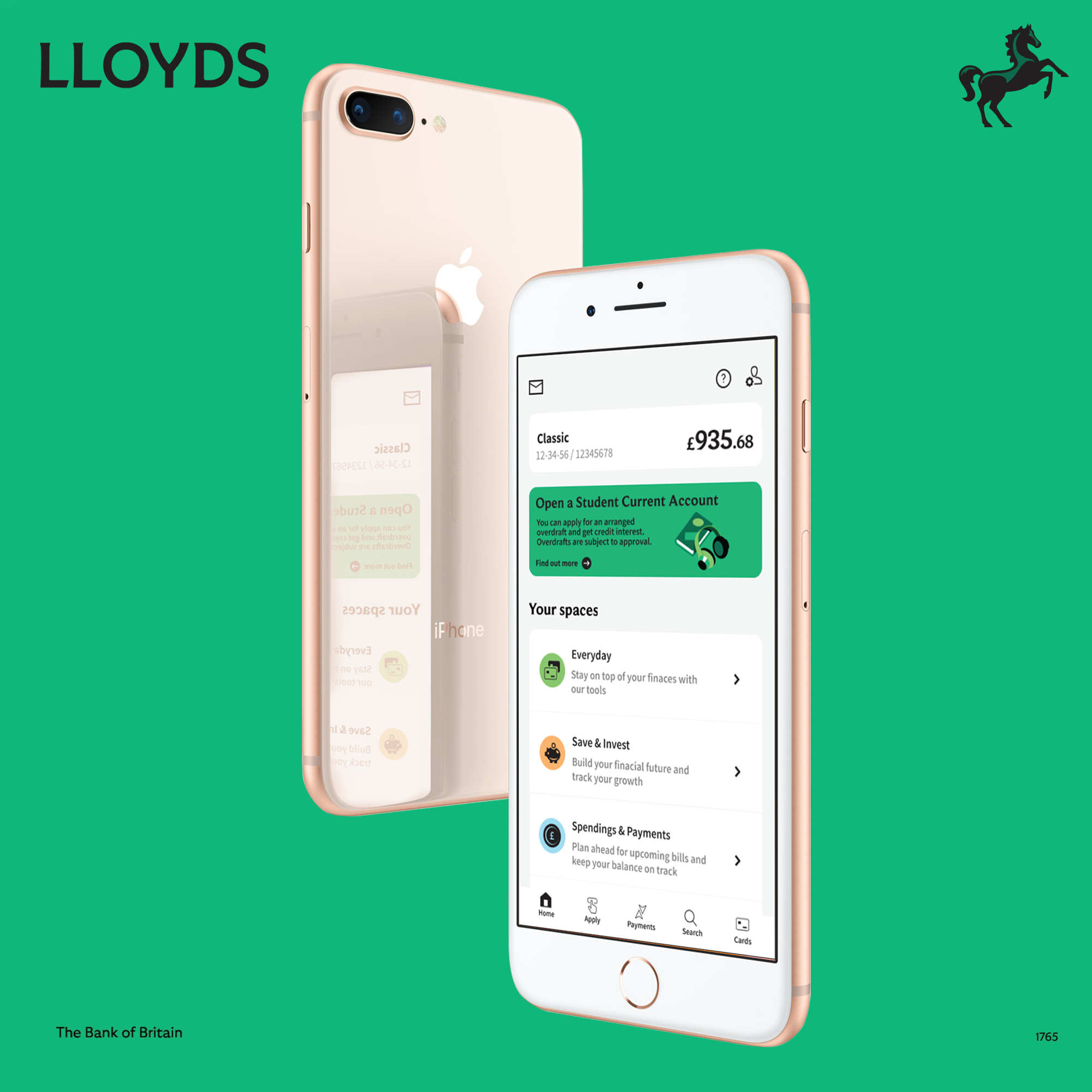
Lloyds bank Ui Overhaul (uni)
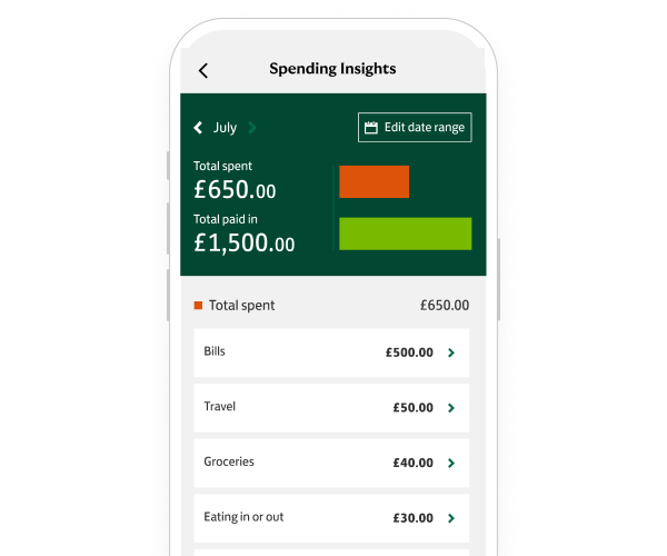
For this project, I looked at changing a specific segment of the Lloyds Bank app that seemed outdated, and people found difficult to use. I also researched other banks to see how they tackle the same issues. The section I planned on updating was the spending insights page, as at the time, UI was massively updated and changed how the app looks; however, the spending insights page didn't really change much and, frankly, looks more similar to the old design.
It tells us how much we spent against how much money was added, but that's about it. The graph is difficult to read, slow and a lot less intuitive. It takes a long time to set up a certain date for expenses, and takes around 3 different pages to see the date of an item you have bought.
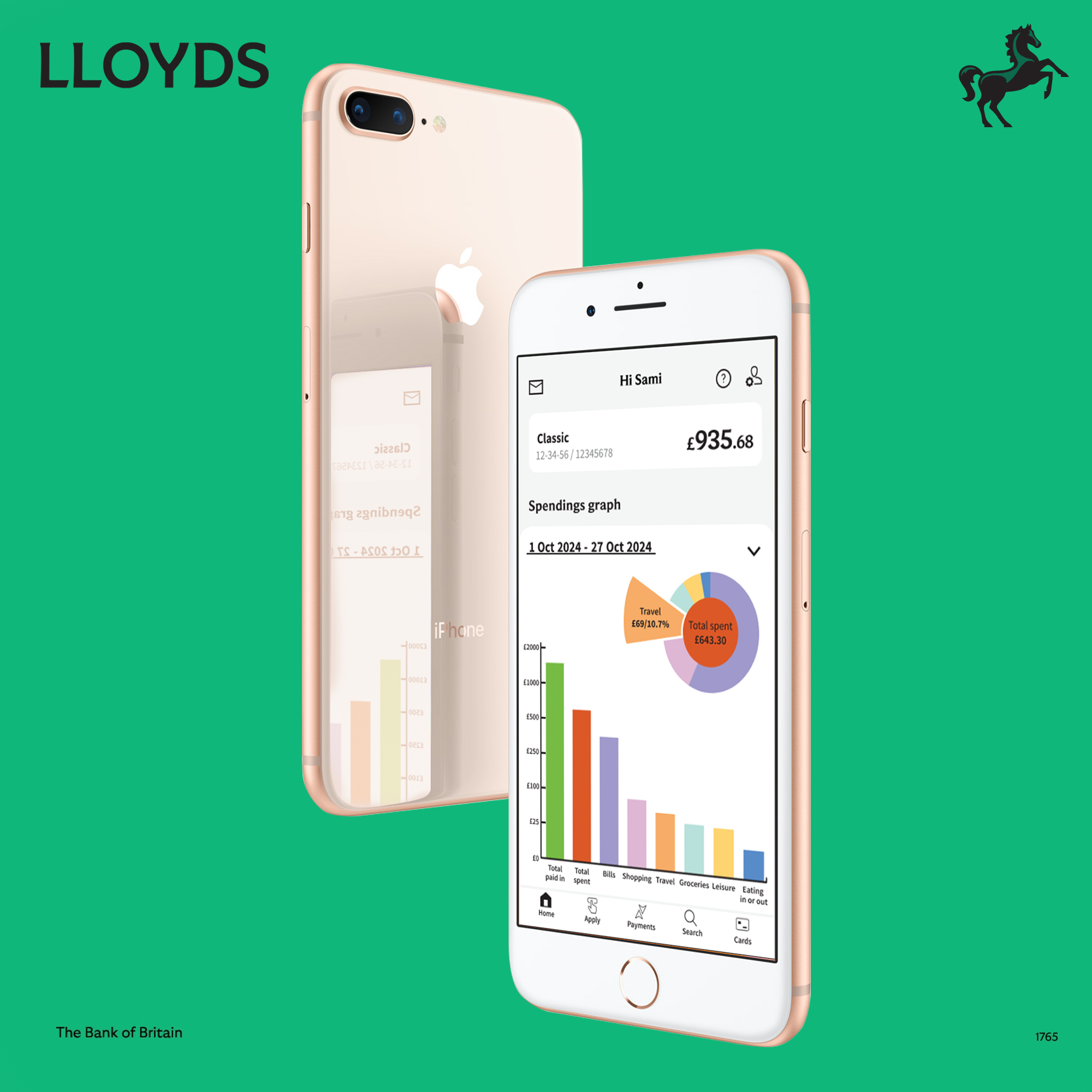
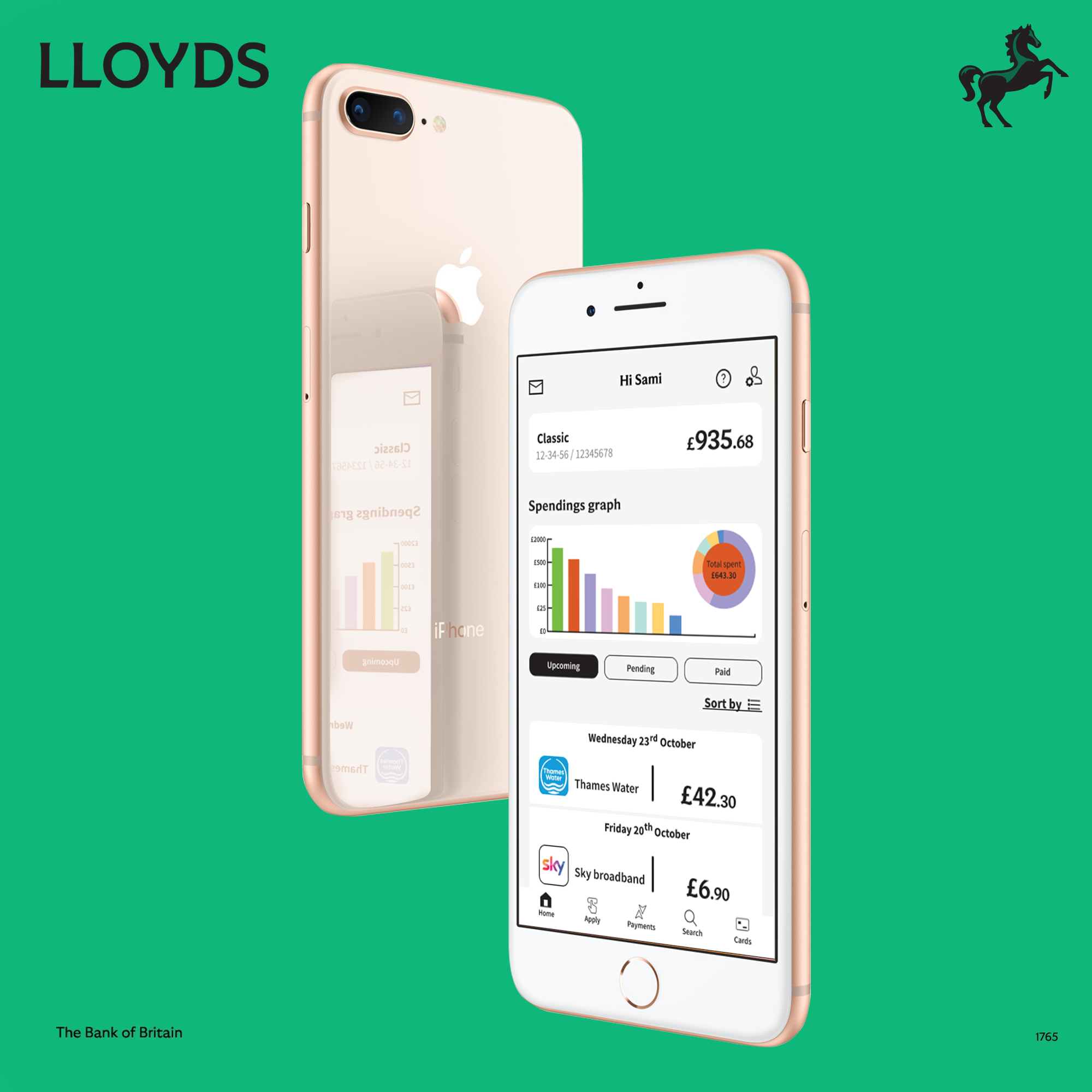
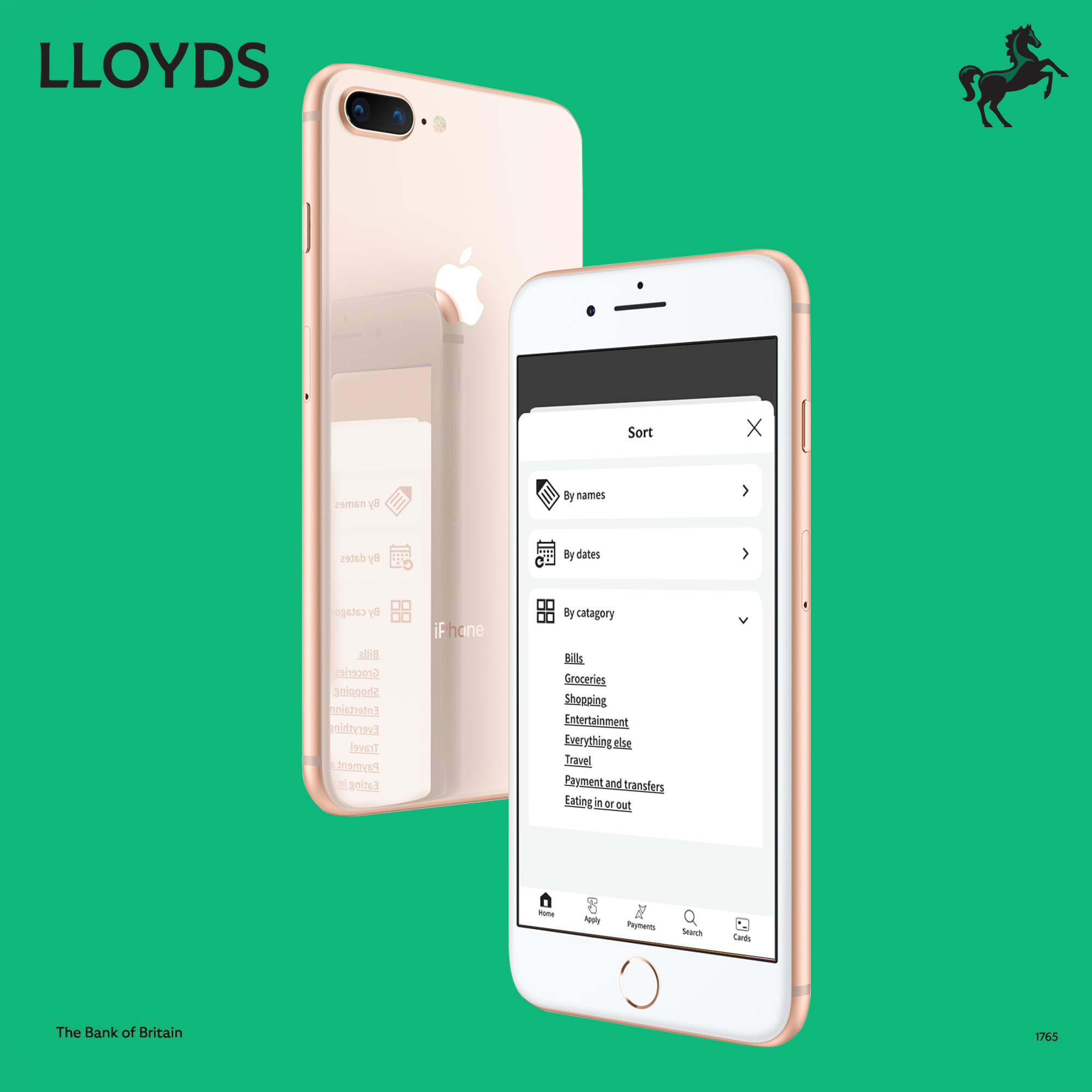
Here is a picture of the old spending insights page (at the time) next to the changes I had made.
Lloyds
My changes
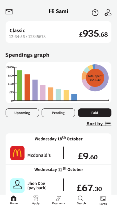
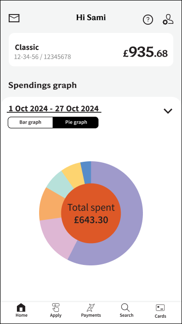
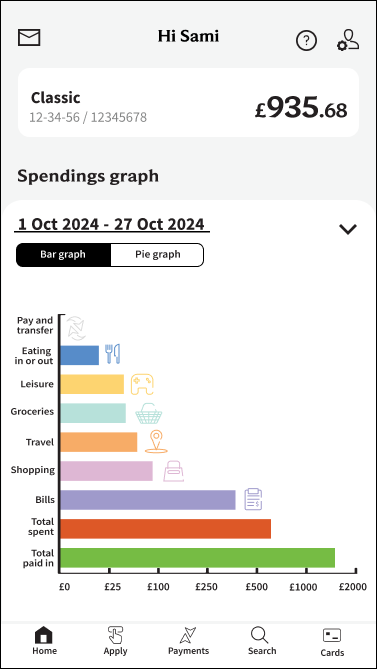
I had also changed the front page to go straight to spending insights and added extra settings to make it more customisable depending on the user.