LCCA GAMING LAB SUb-brand (uni/live)
LCCA were currently in the process of re-launching our Gaming courses and is looking to position them as part of the Gaming Lab at LCCA. The goal was to create a sub-brand for their Gaming Lab that positioned it as the place to study gaming-related courses while keeping the current branding of LCCA in account for the creation process.
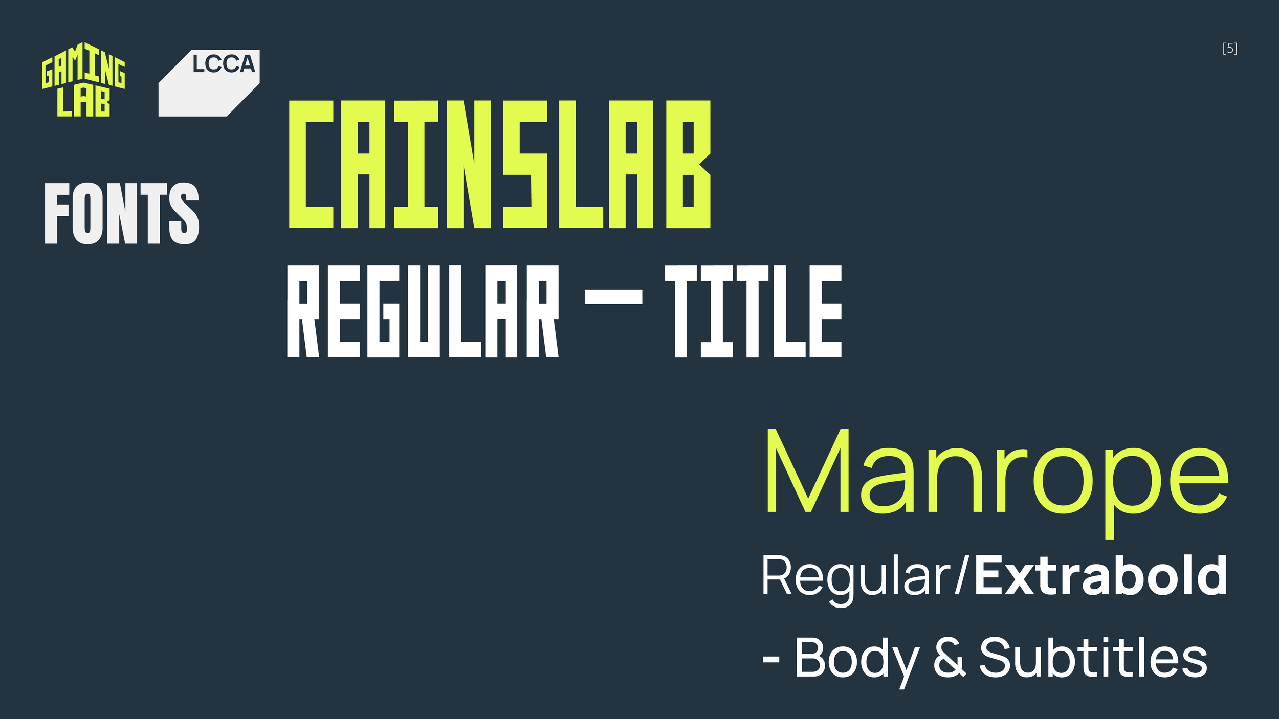
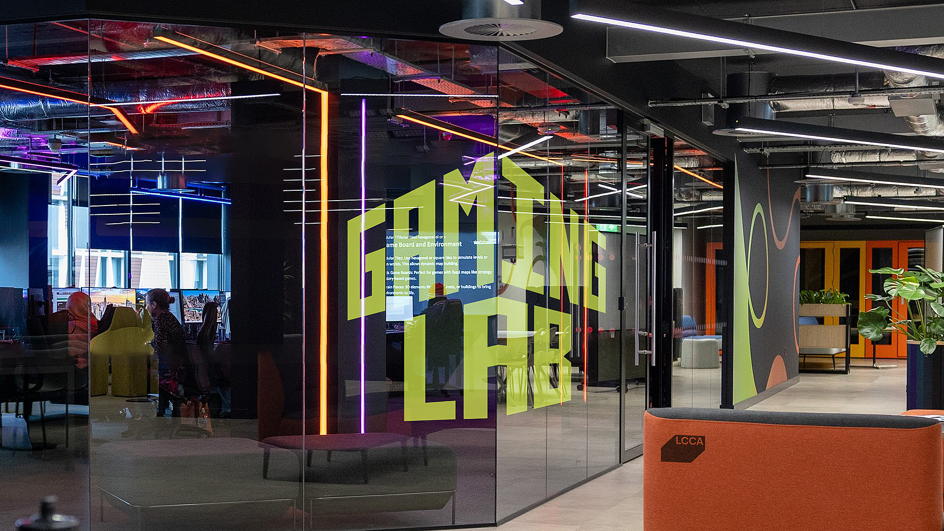
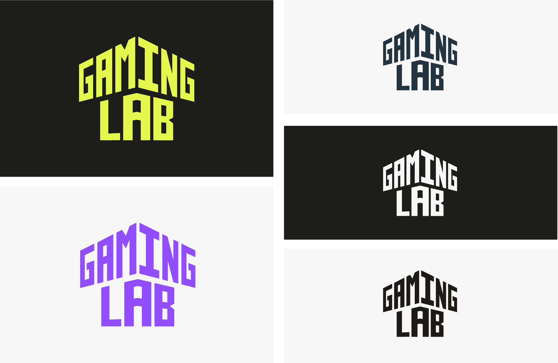
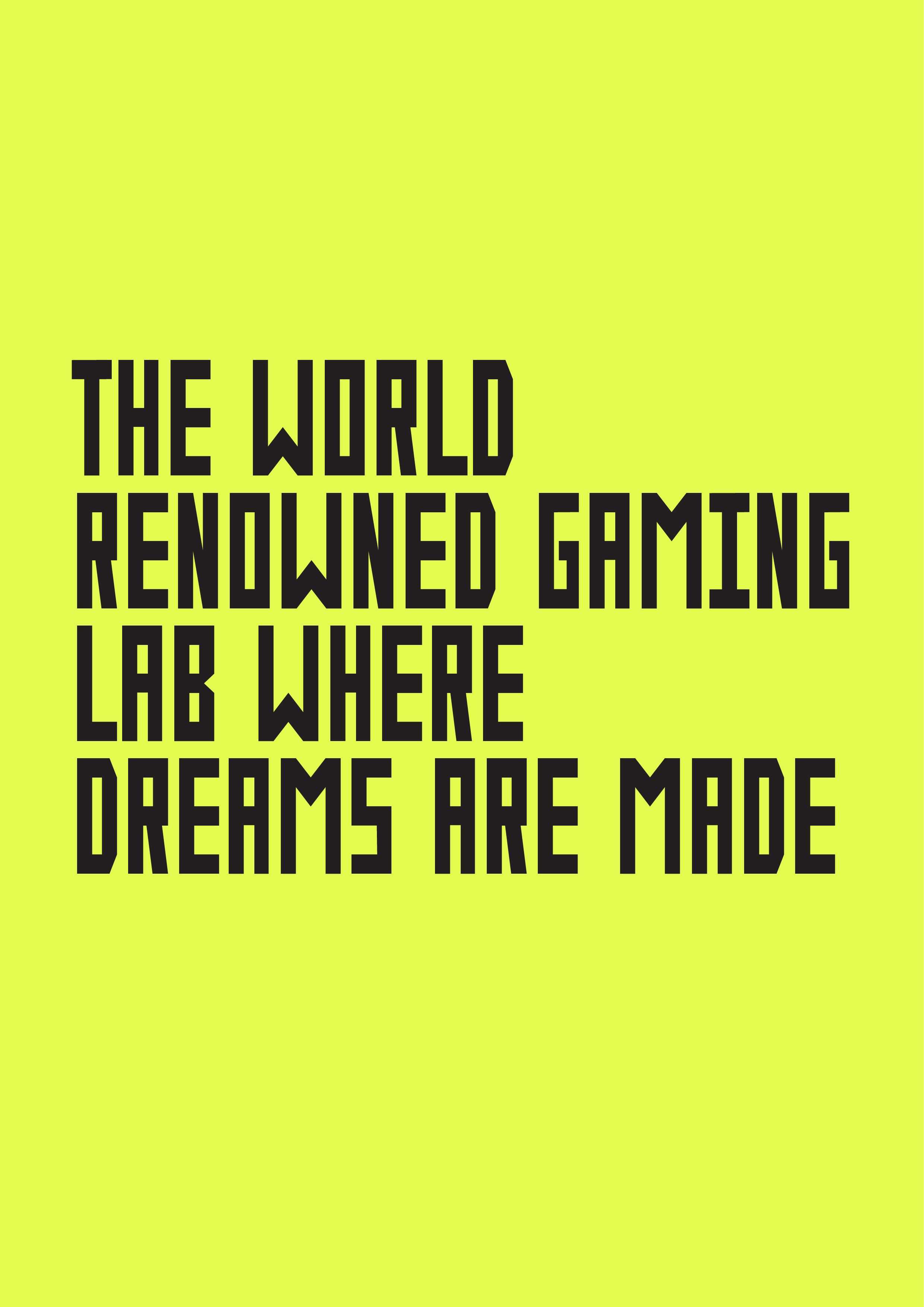
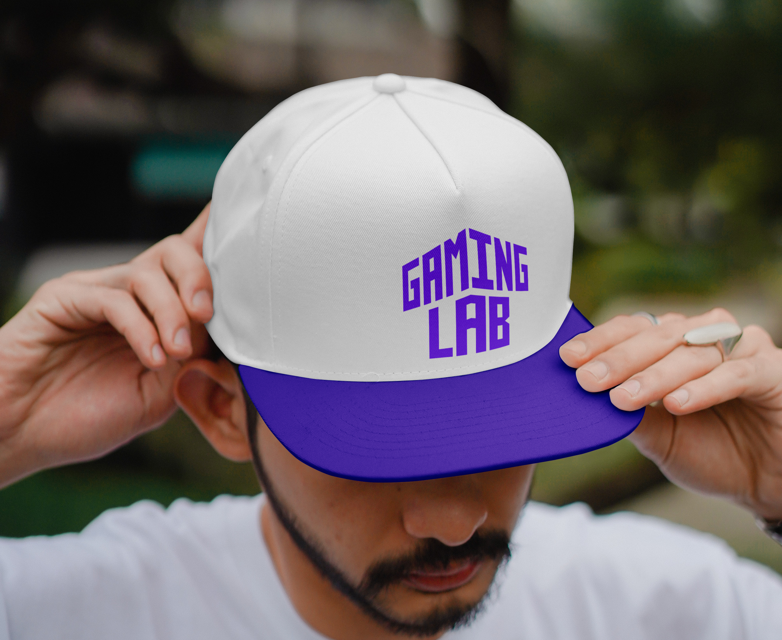
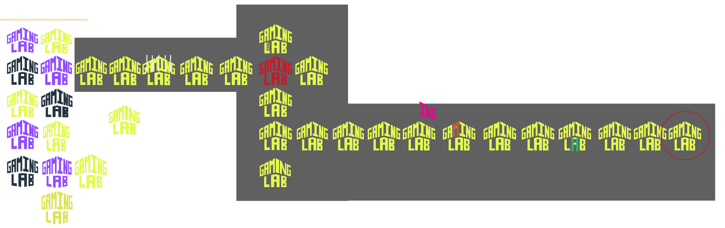
The final logo is a building-shaped design using a font I had developed during the project through research on games and other universities. The reasoning was that the clients liked the idea of having the Gaming Lab be known as a space, and having the design be shaped as their campus fell within that reasoning. The design can also be seen as an arrow icon, which in many video games can mean to level up, so In away the logo also says that ‘to come to LCCA is to level up one’s ability ', which was also an idea liked by the gaming course tutors.
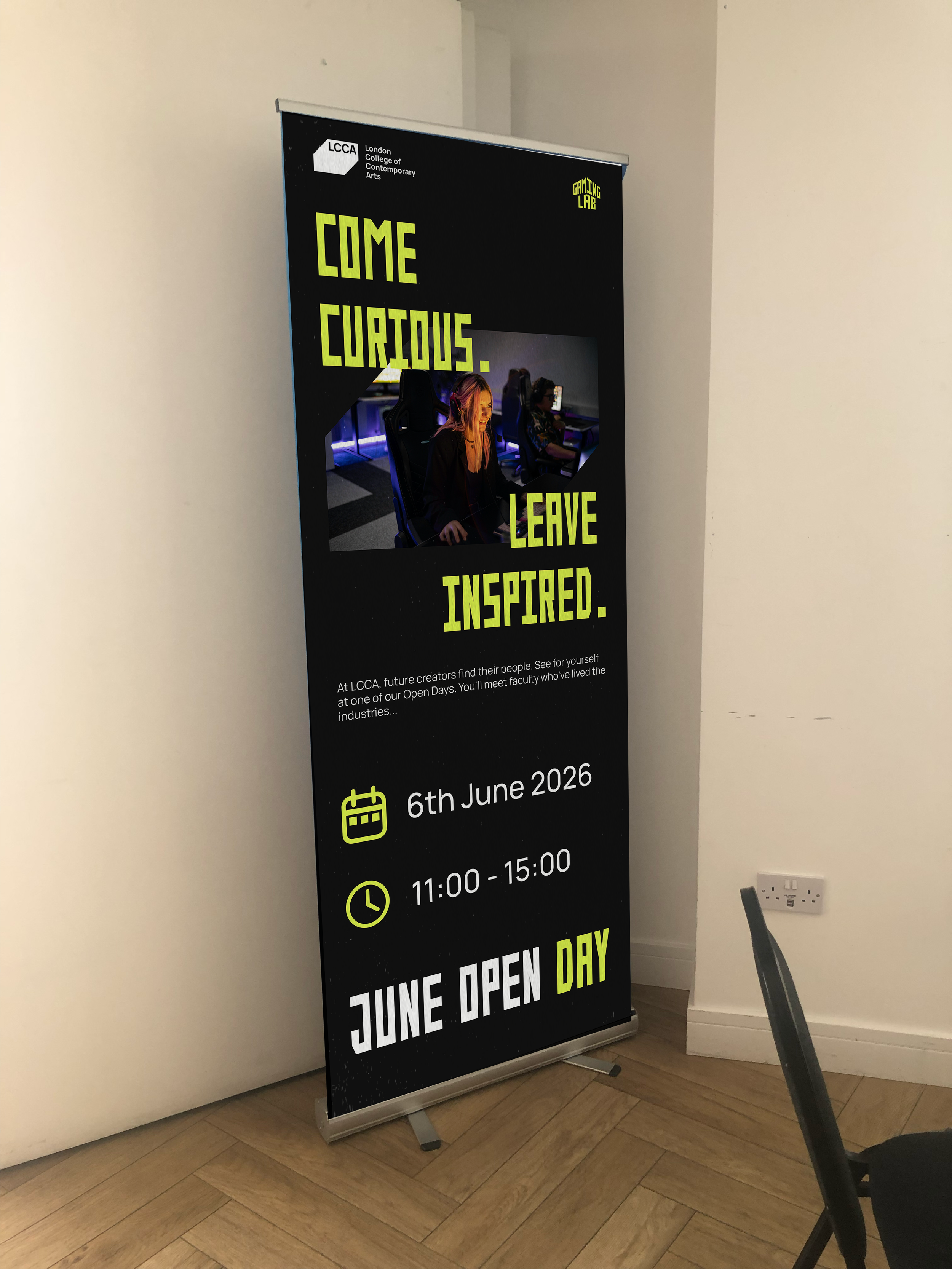
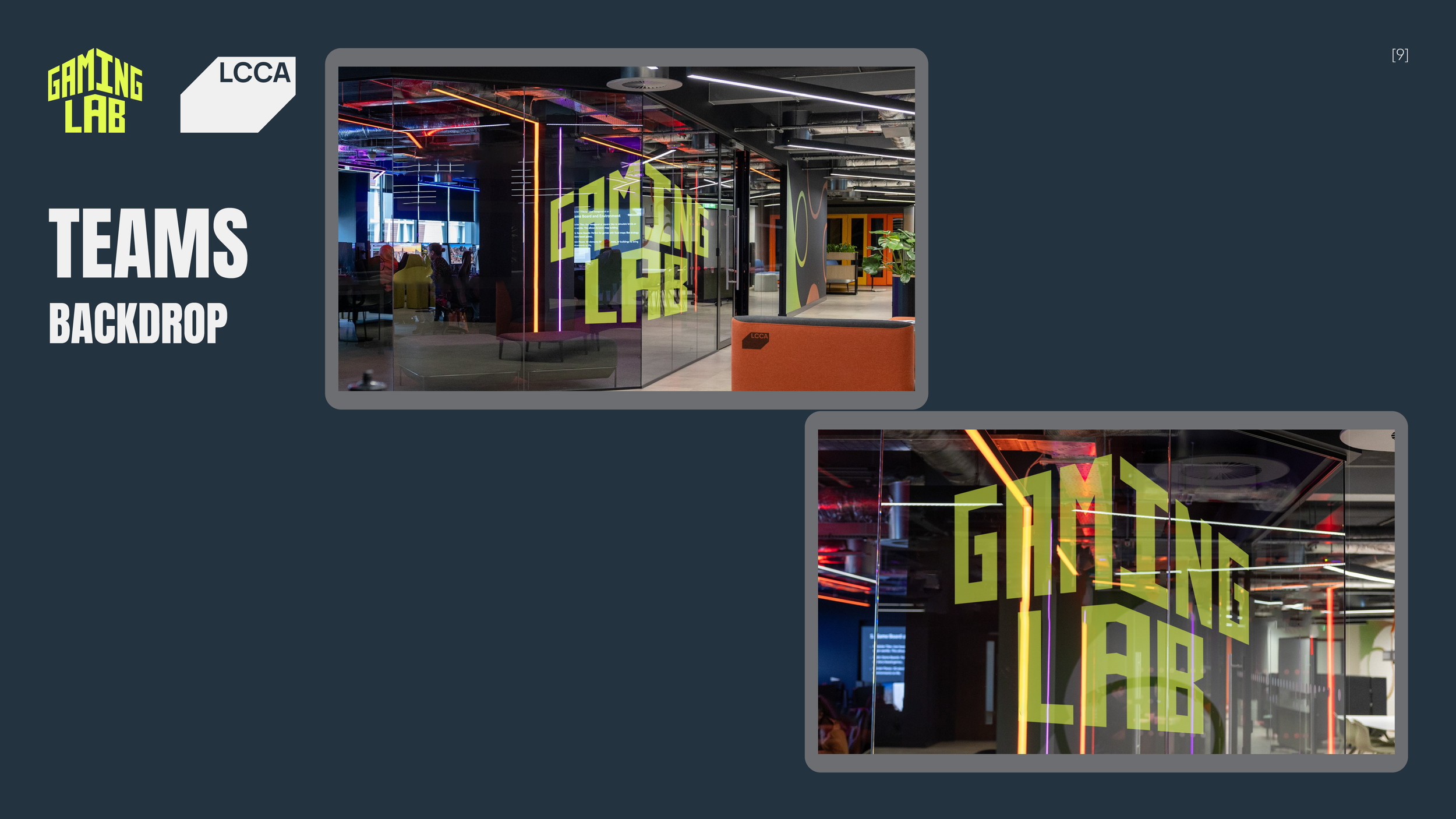
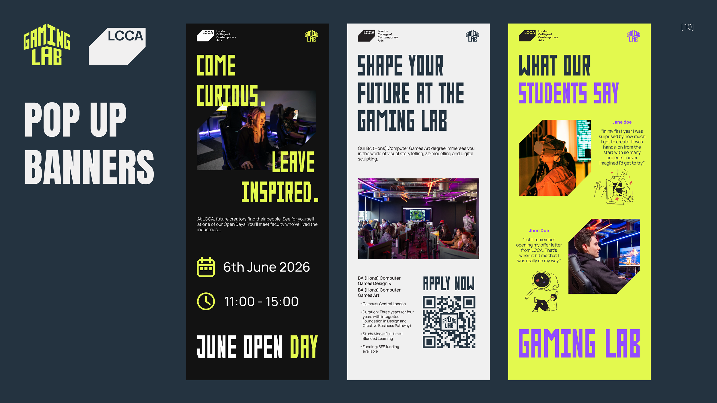
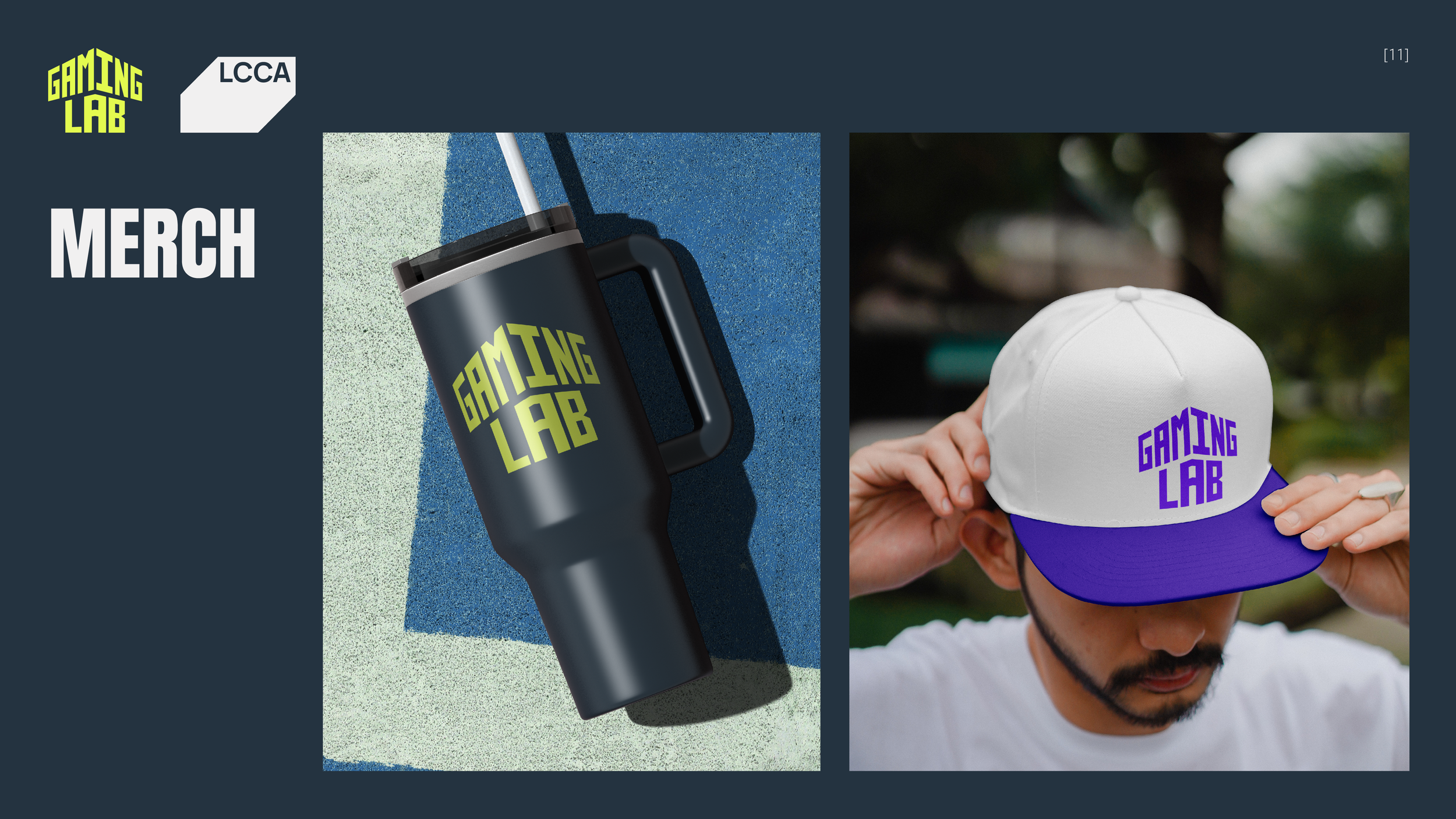
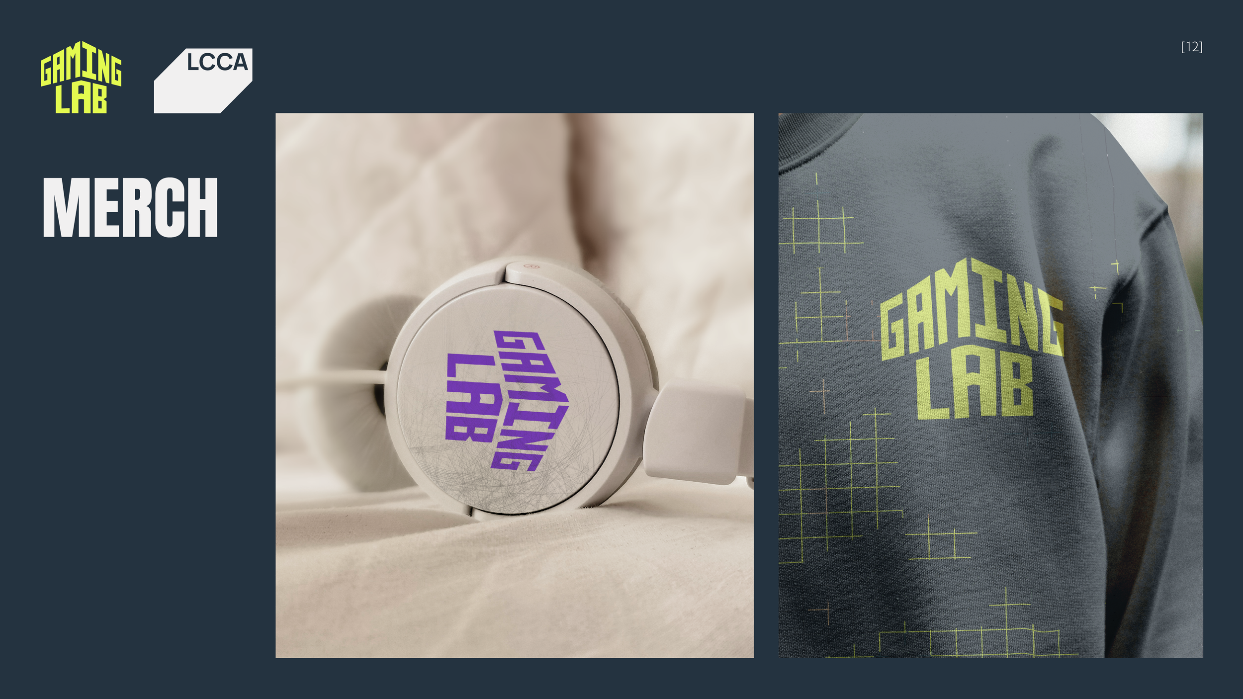
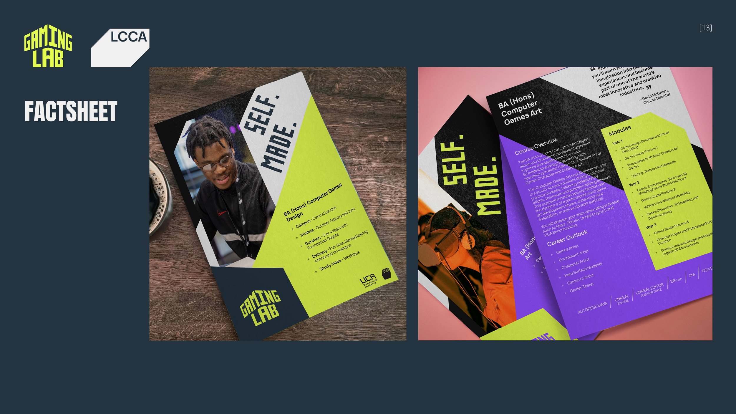
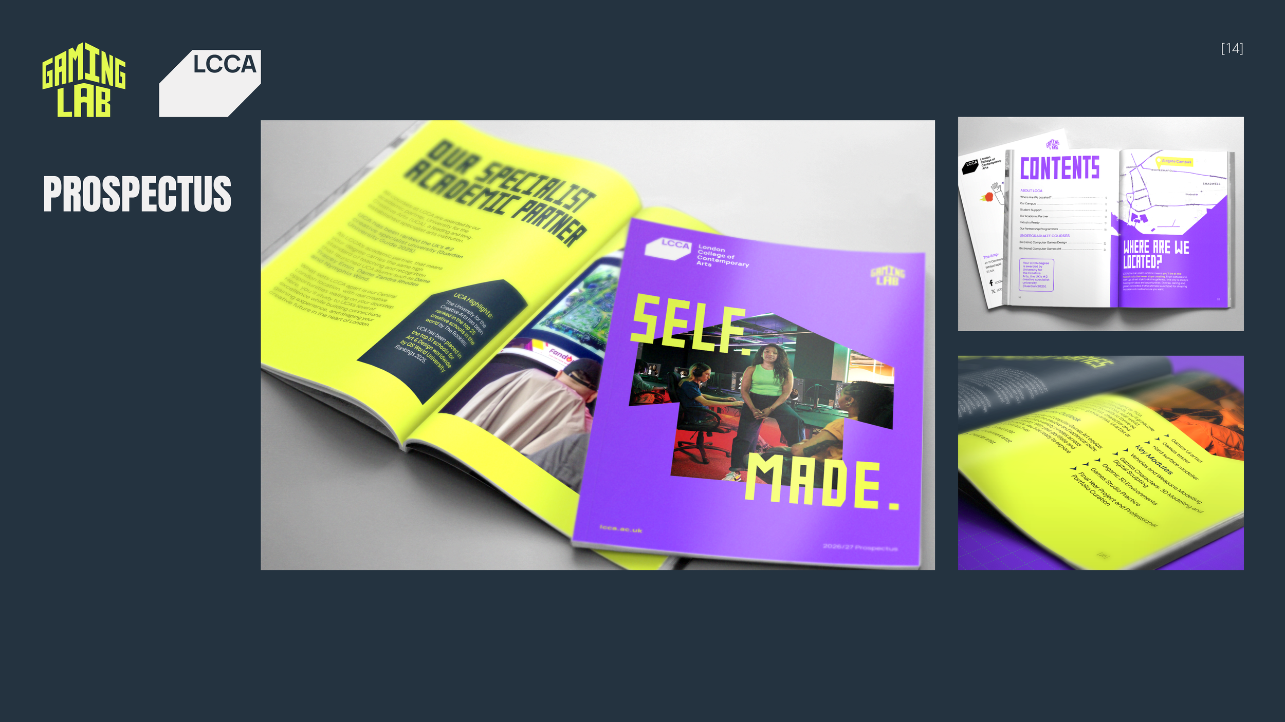
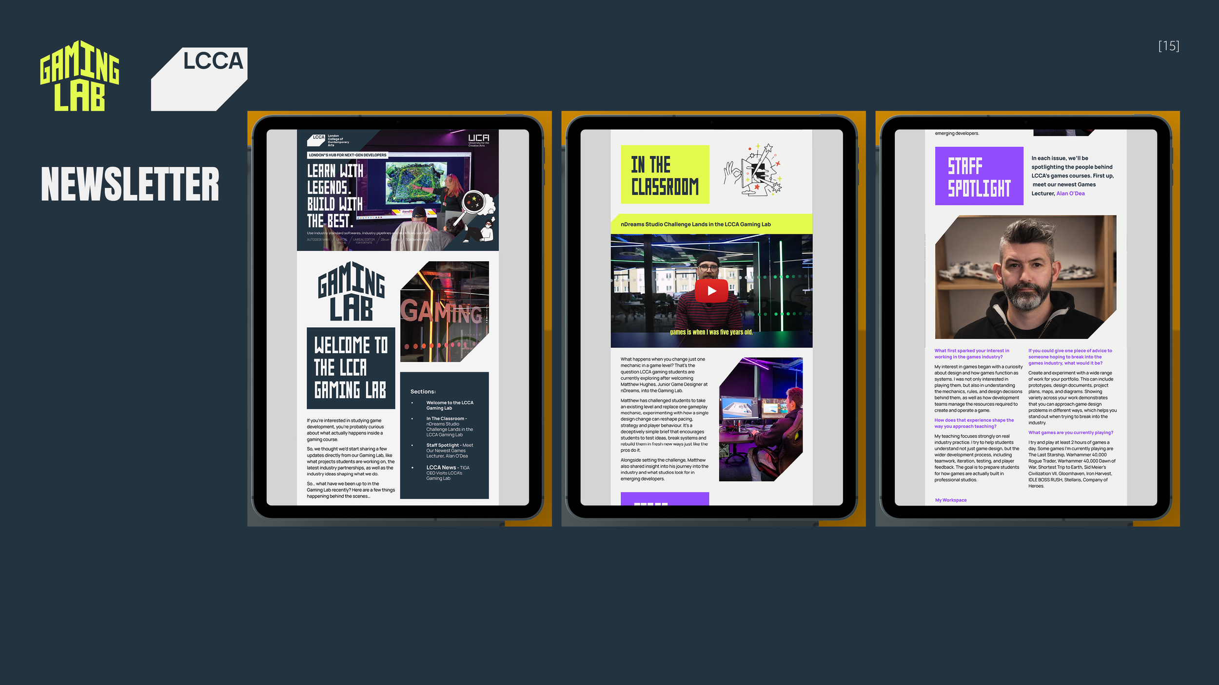
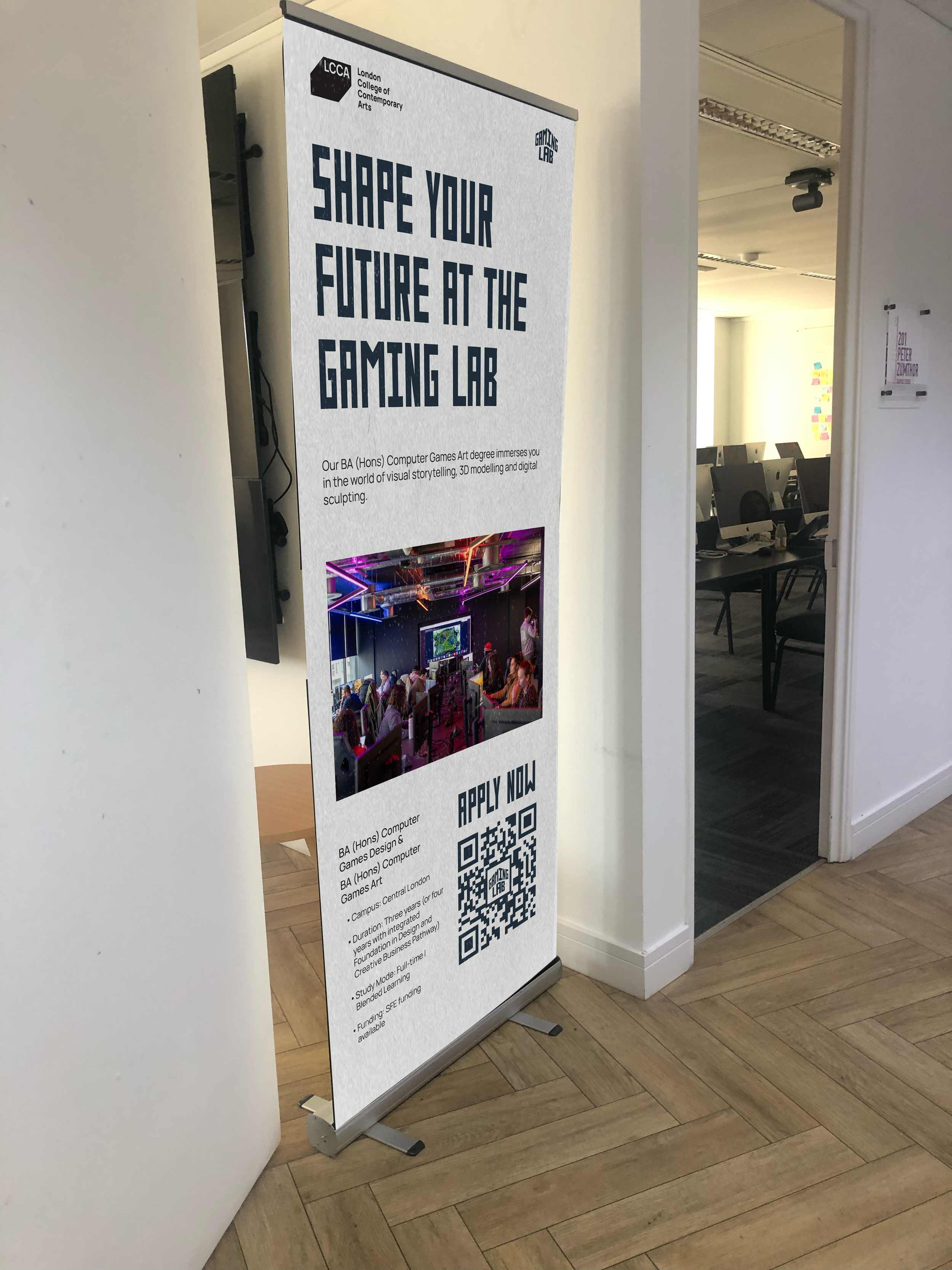
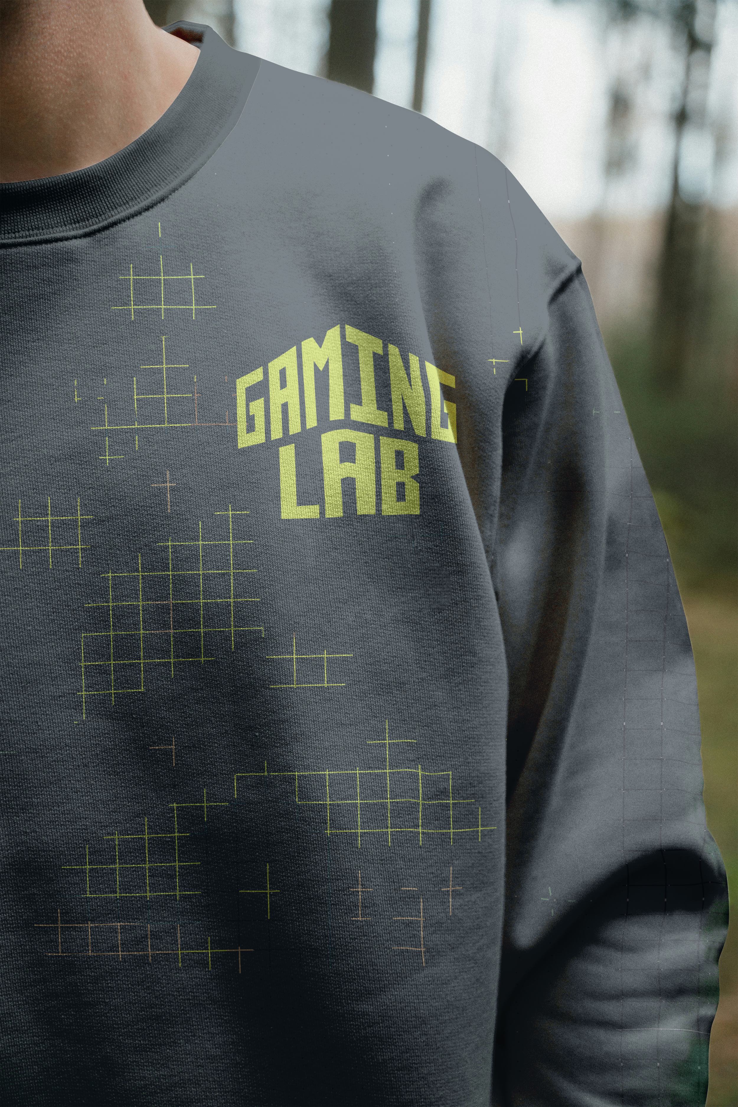
The logo wasn’t the only deliverable; they also expected pop-up banners, a Teams backdrop, course factsheets, a Gaming Lab newsletter, merchandise, a prospectus and a brand guideline. I developed these in InDesign and Illustrator using the branding elements I created and the ones they had supplied us.
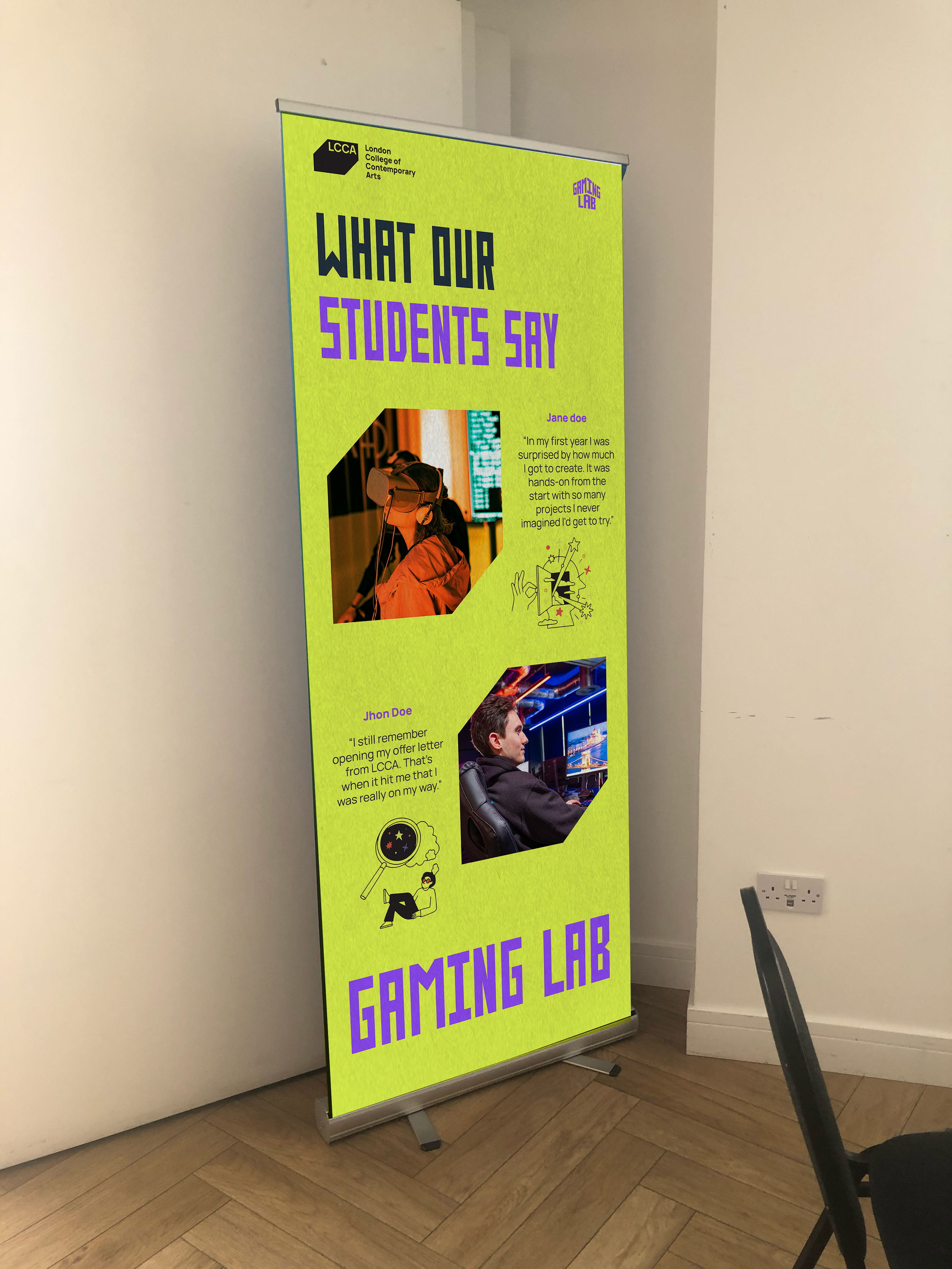
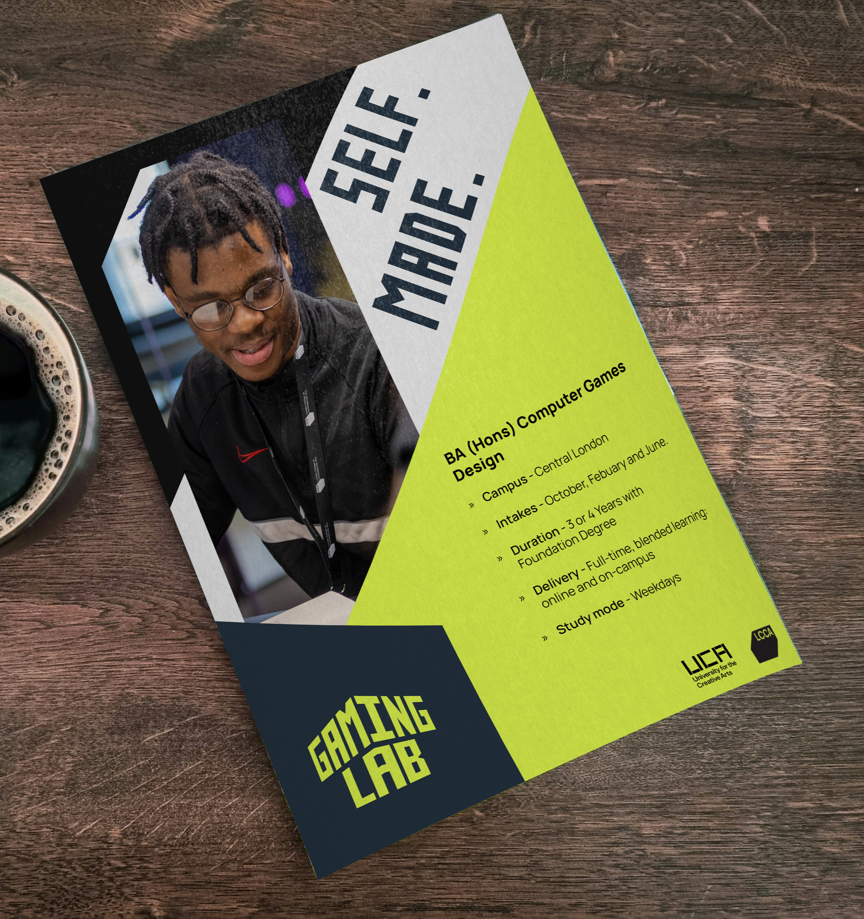
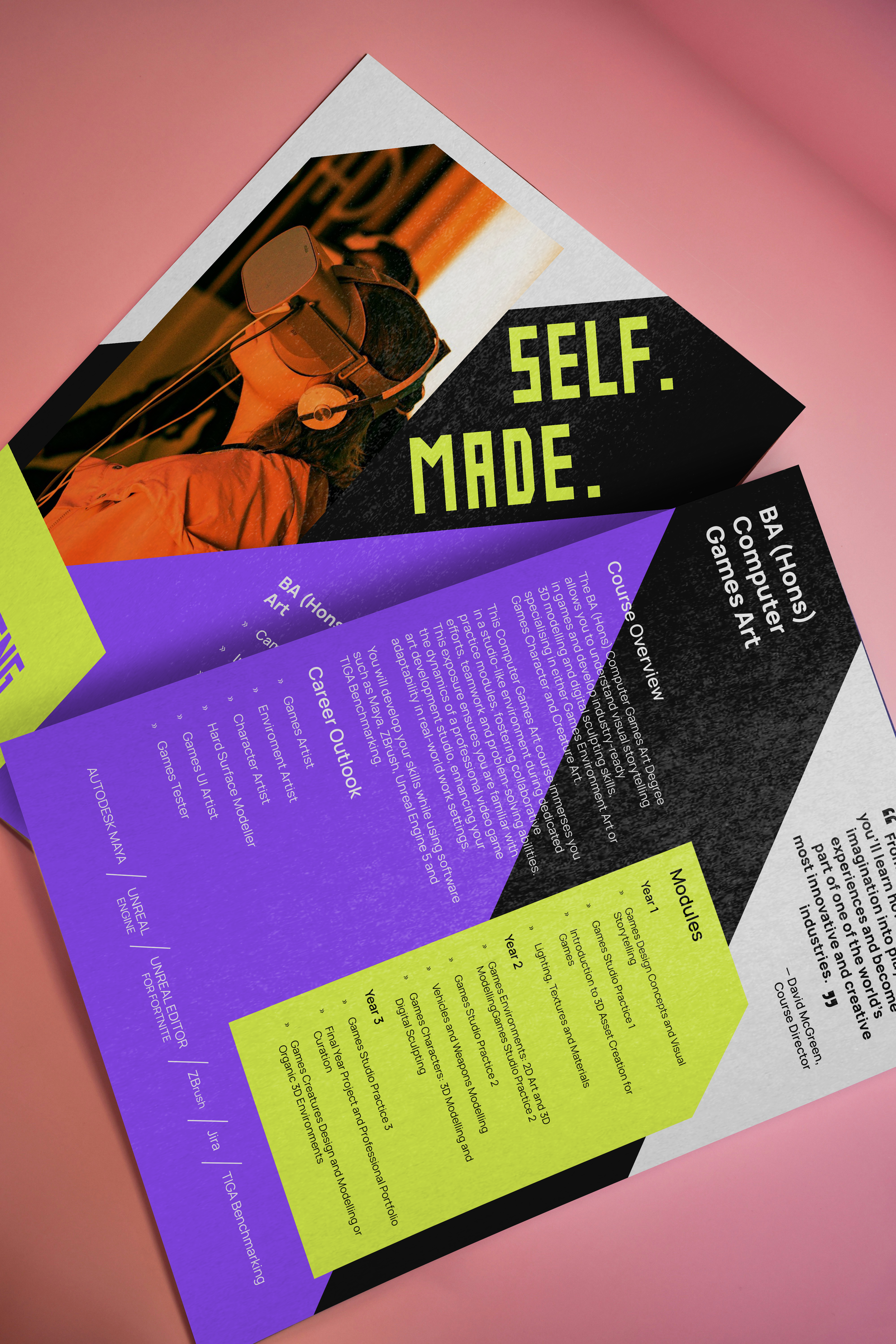
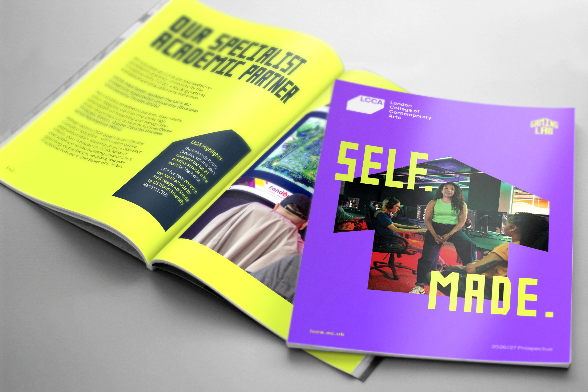
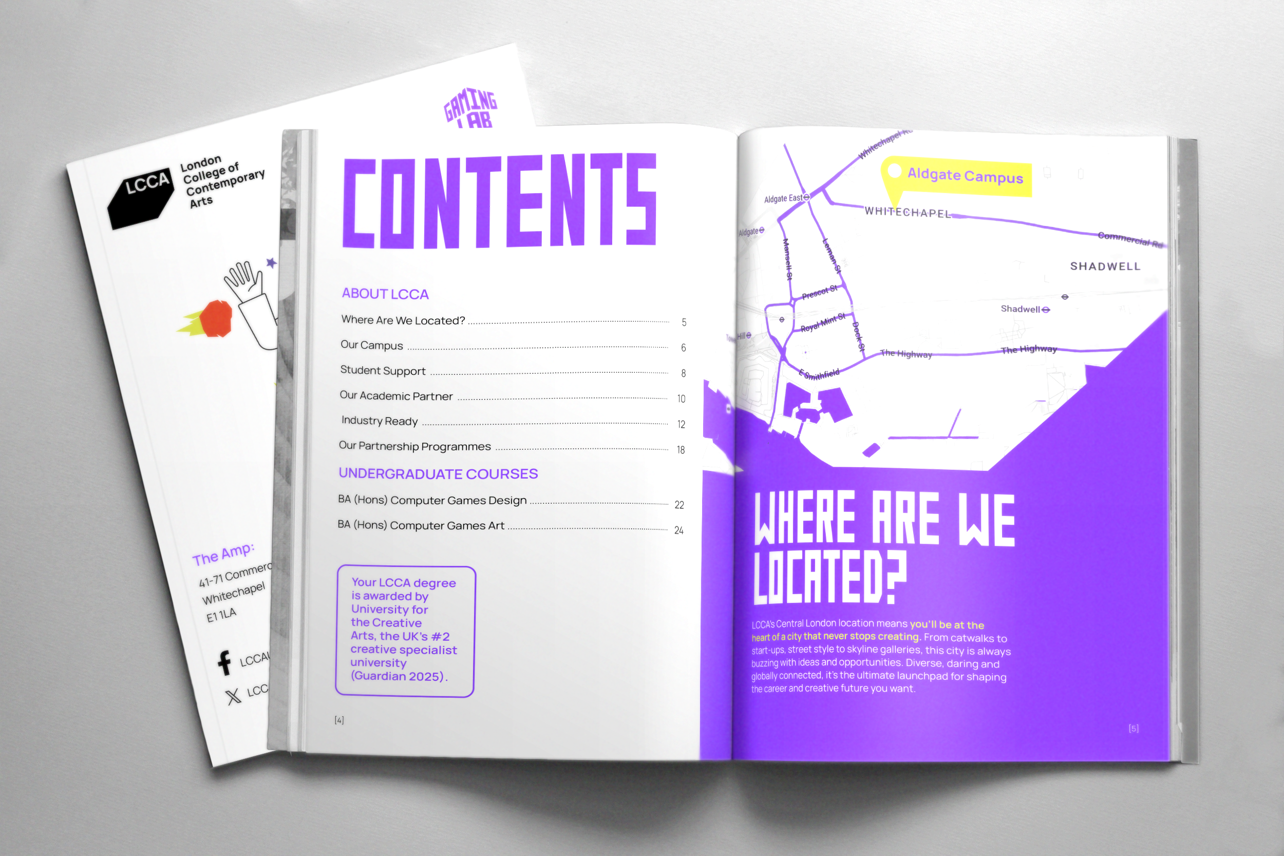
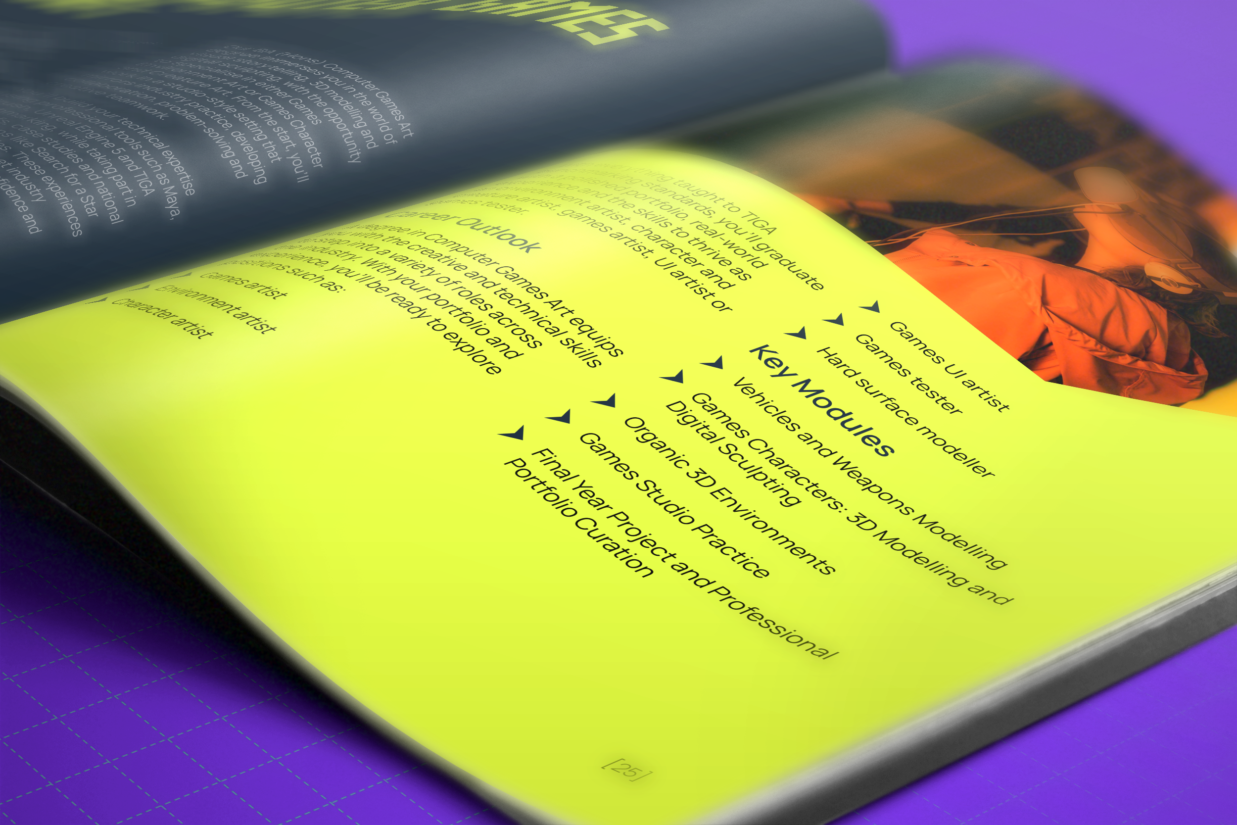
The prospectus was the hardest of the deliverables to produce, as it was a lengthy document and the university had not supplied the necessary information to finish it by the two-week due date. I used a mixture of my own branding elements I had developed over the project, including my own typeface and the already existing branding for the university.
There were many iterations of the logo, with so many minor changes based on client feedback. These are some images of my design process for these logos. I would make many versions based on what I think might look interesting and also based on any suggestions I had gotten, as at this stage any design could end up being the final one.
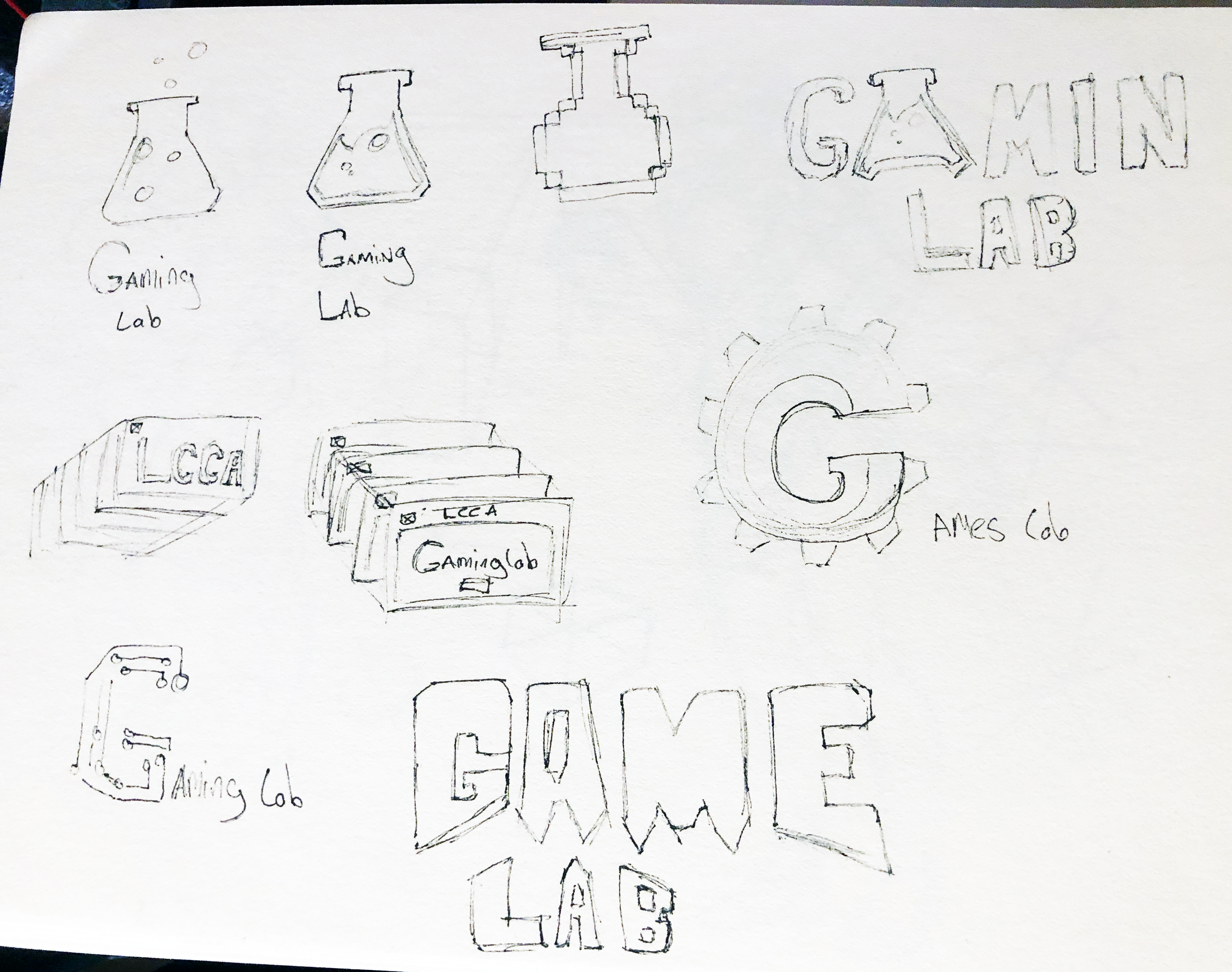
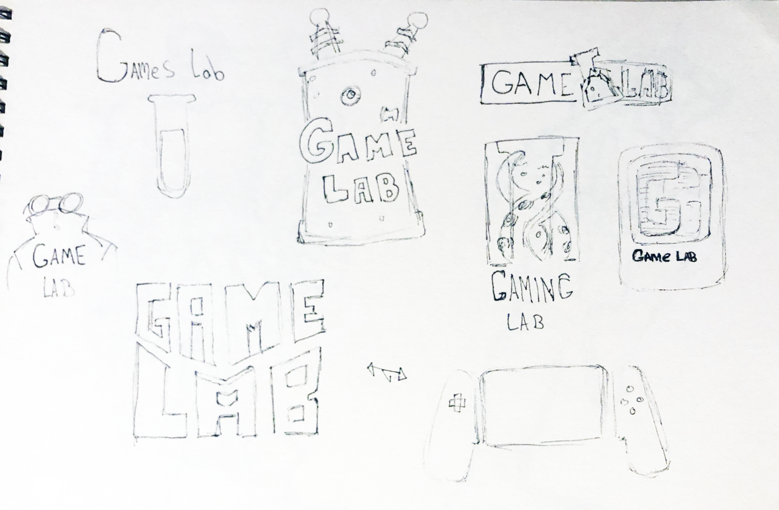
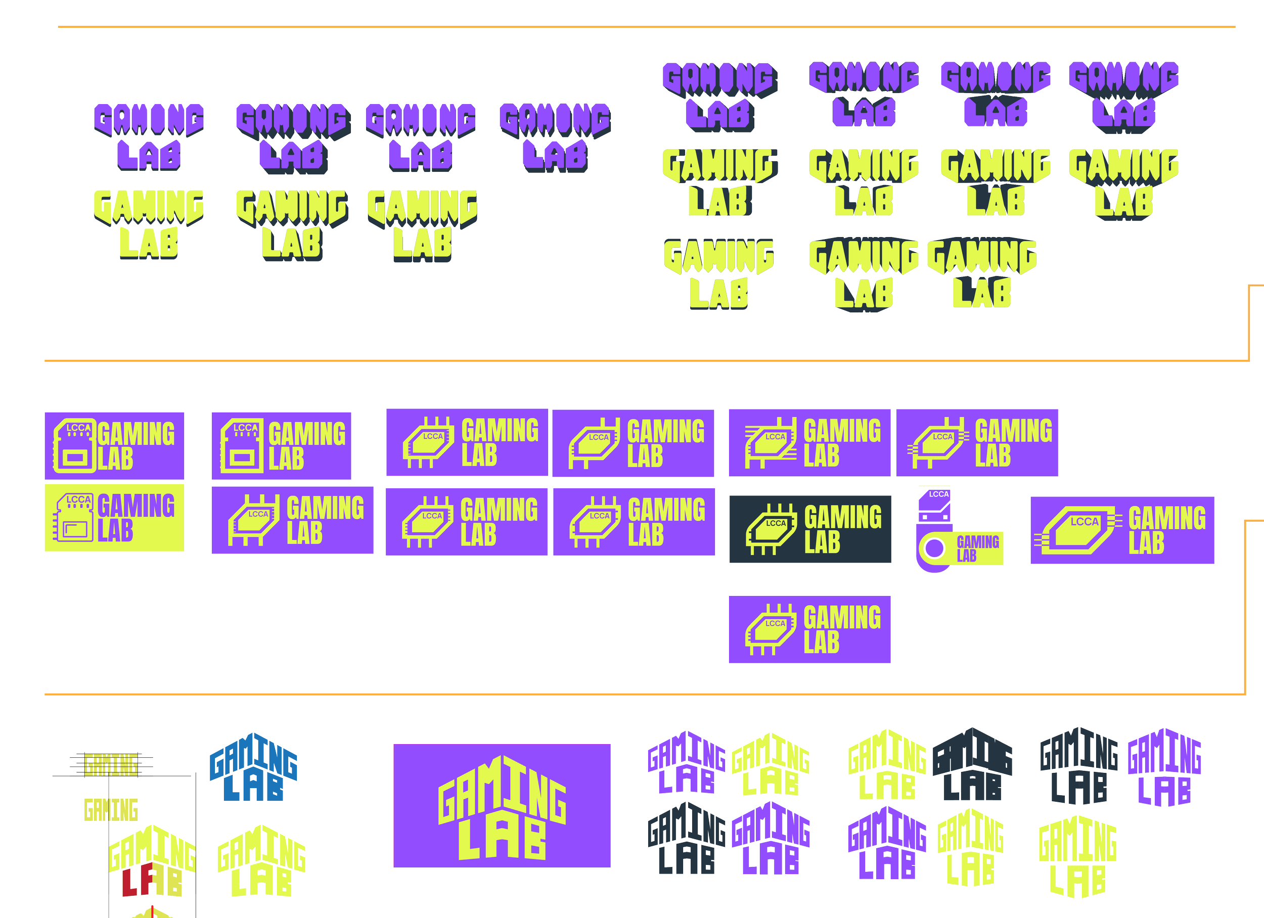
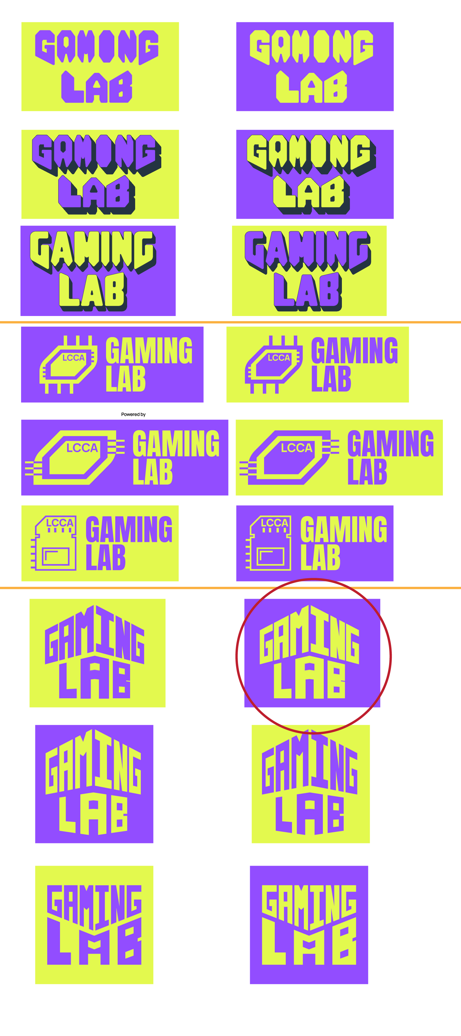
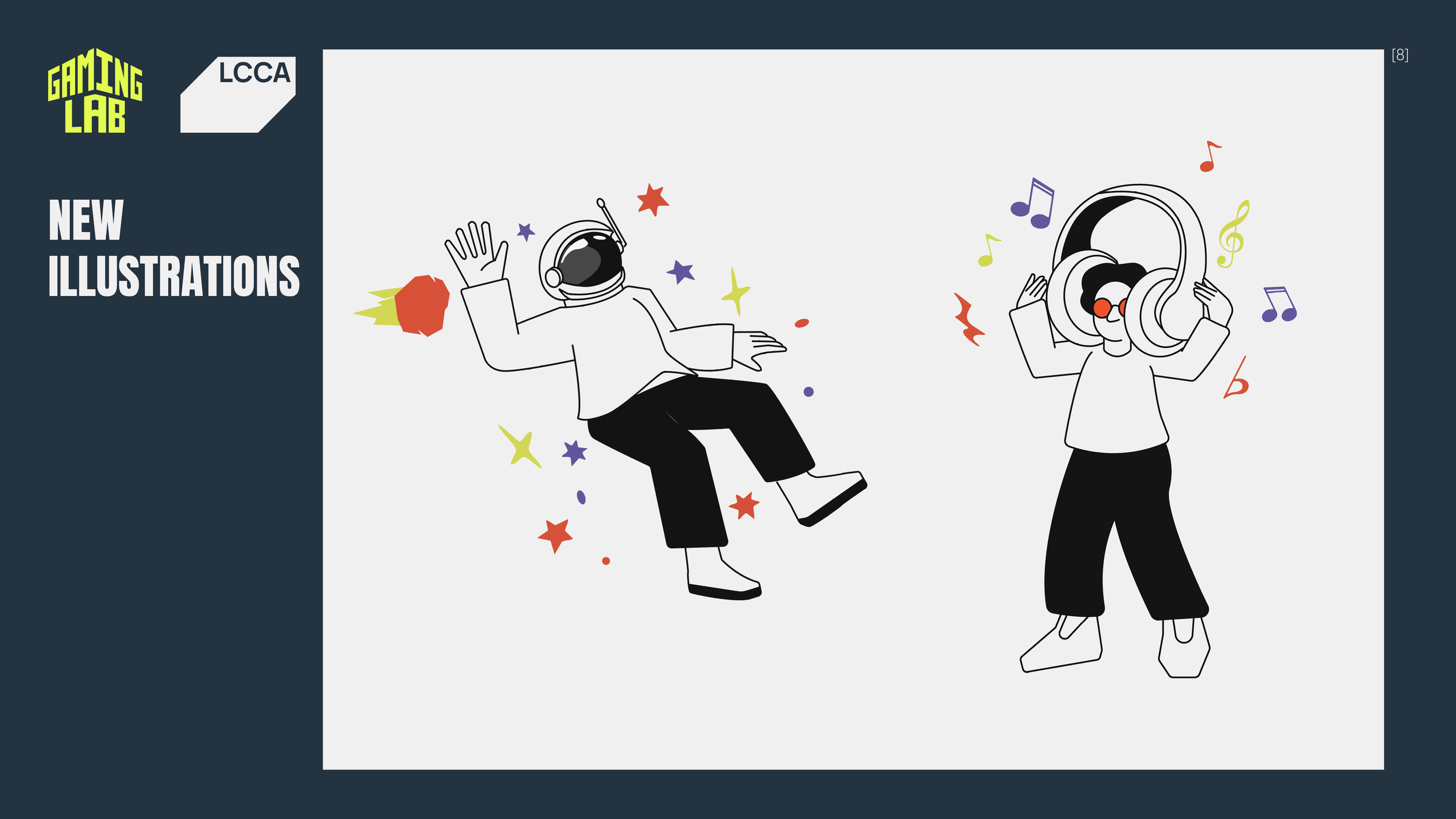
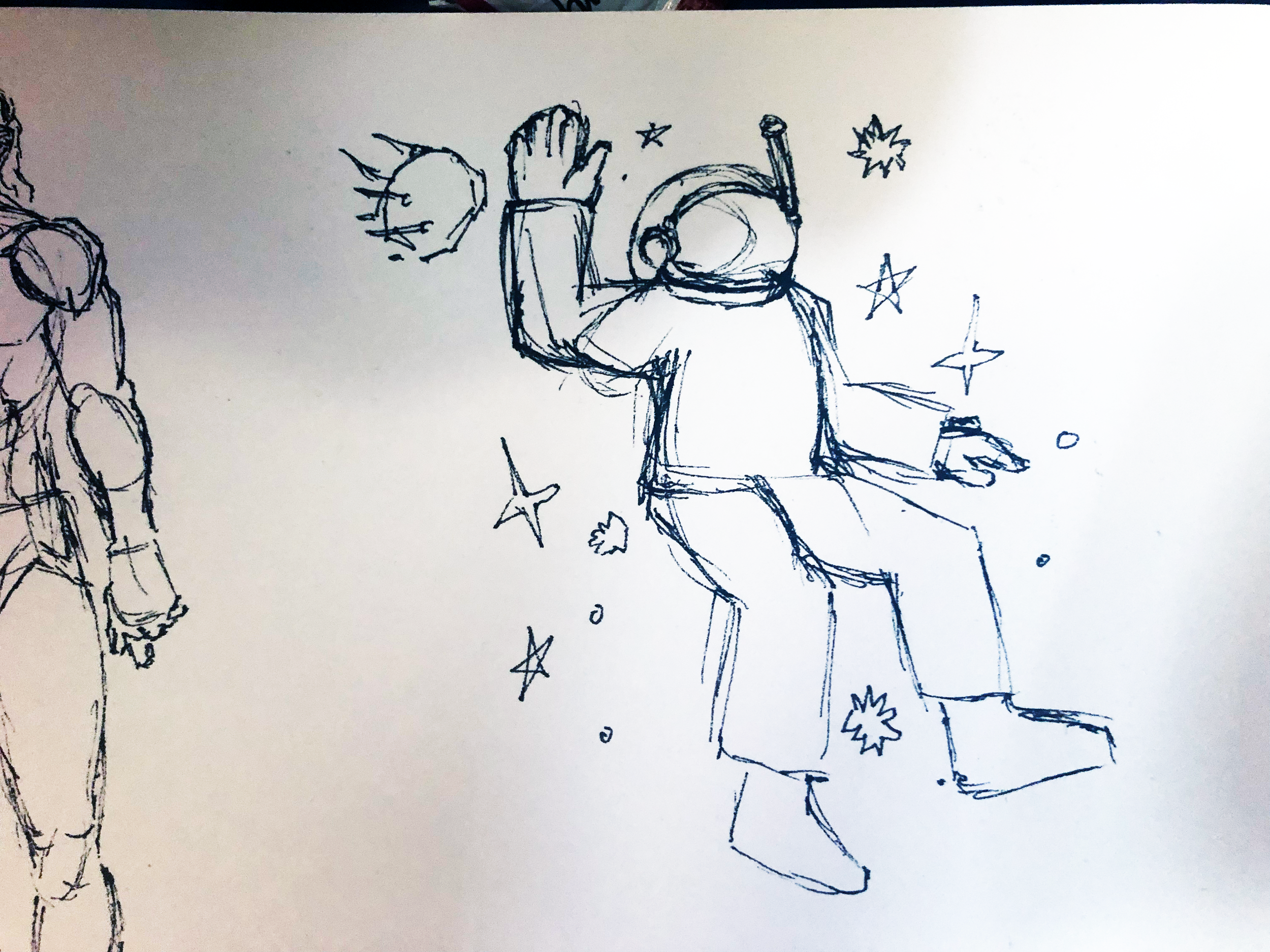
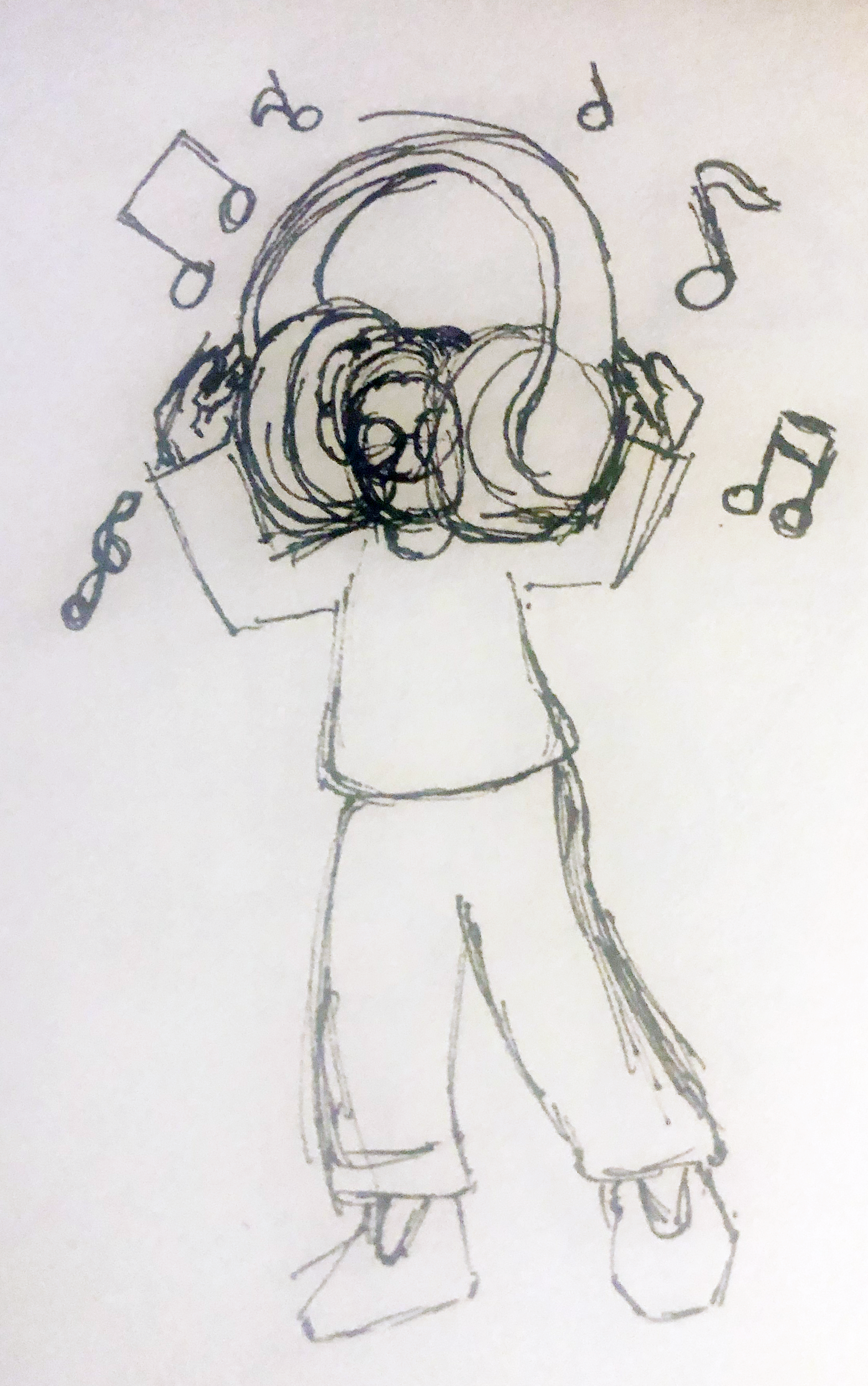
They had also mentioned how, if we could, we could also design some more illustrations based on the style they had, which they had shown in their brief and proceeded to use them in tandem with the original one in some of the deliverables, such as the prospectus and pop-up banners.


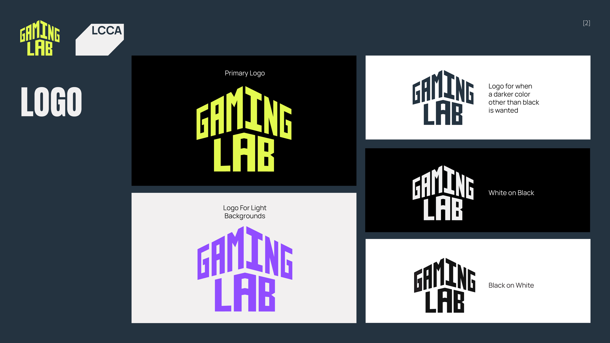
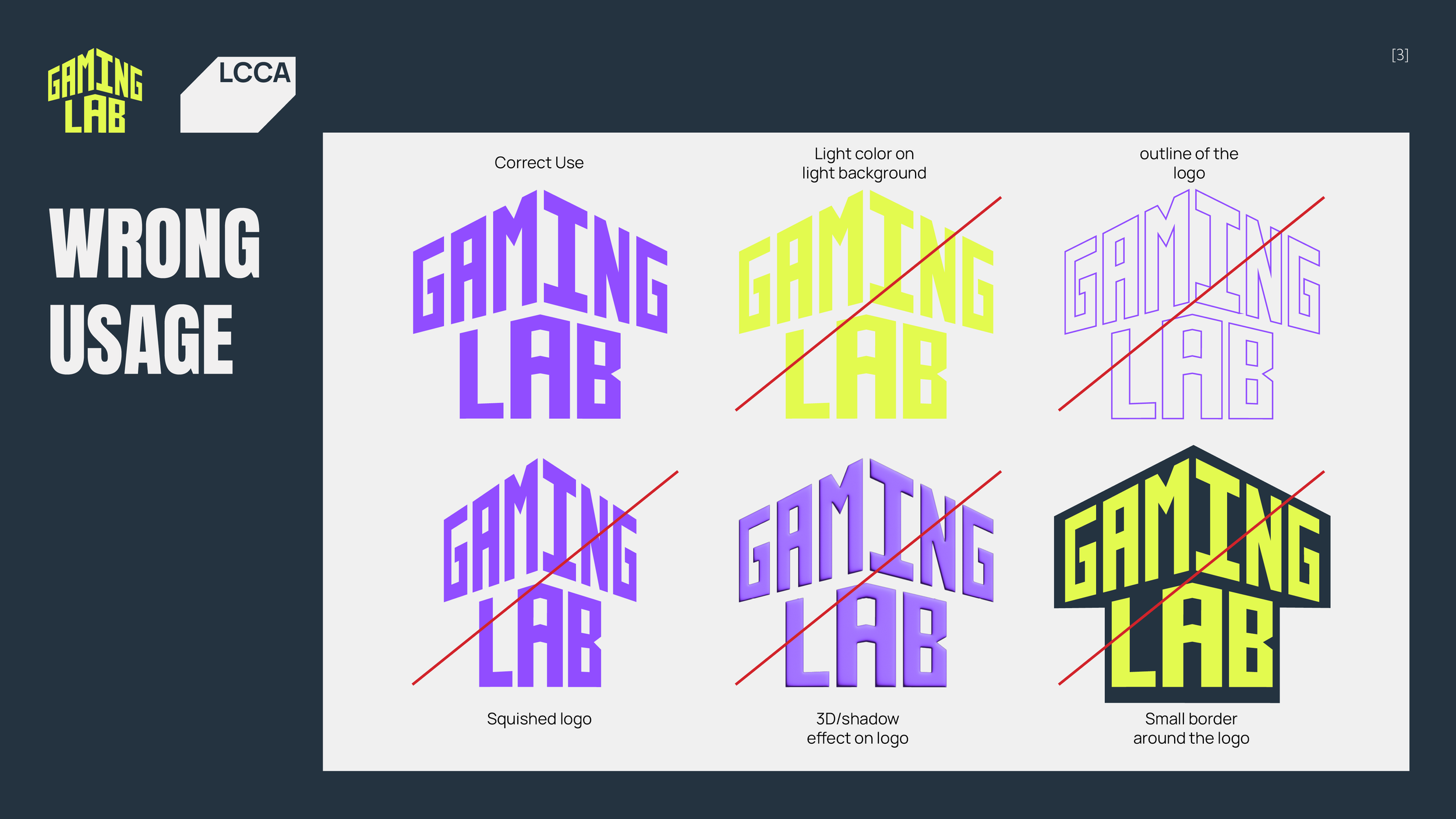
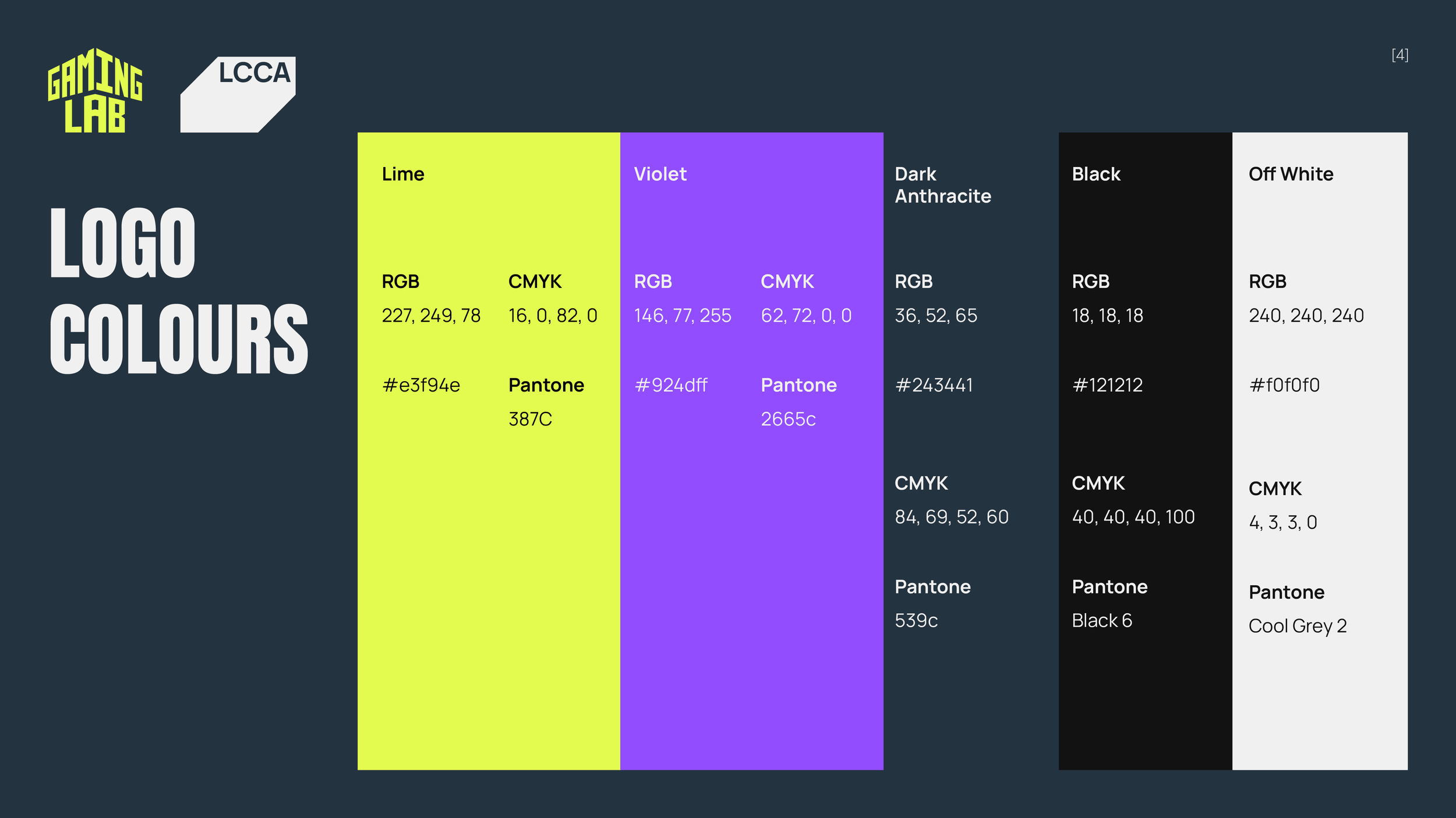
The final deliverable was the brand guidelines, where I show how to use the new logo, what colours should be used and the main typefaces for titles and text.